In 2008 we designed a hurricane tracker for MSNBC, right as Irene was “bearing down on Louisiana like a shotgun full of wind and rain.” The project worked fine for several seasons of hurricanes and tropical storms, until Apple killed Flash in 2011 and the world of interactive mapping and data visualization turned its attention to HTML5 and mobile platforms.
Here’s what I said about it at the time:
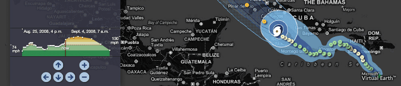
I’m really pleased with how this project’s turned out; in particular I’ve not seen a map like this before that gives a sense of the relative speed that a storm moves at (take a look at how Gustav slows down as it passes over the southwest coast of Haiti). It’s not something I’ve really ever thought about before, but now that I’ve seen it, I’ll be looking for it in every other map like this I see — which is just how I like to change the world. Congratulations to Tom and Geraldine for pulling this one together.
This is the first time that we’ve released something this concrete. At dinner last night Lane told me that it was the first time he’d seen something that Stamen had done that was going to really matter to him in 72 hours. We’ve historically shied away from doing work that’s overly predictive and analytical, preferring to focus on the lyrical and metaphorical aspects of visualization. This is the first time you can make a decision based on something we’ve built, and I’m glad we seem to have crossed that barrier without fretting too much about it. Just about every big decision I’ve ever made that’s turned out well has been made in lightness and in haste; no sense stopping now!
Much of this carries through in the new version of the hurricane tracker that we released earlier this week. What I said about making important decisions in lightness and in haste still stands (if anything it’s gotten worse), but there are a couple different things about this project worth drawing attention to:
- The client is the Weather Channel (previous work for them here), and we’re working directly with meteorologists to ensure that the representations meet their standards.
- It’s in HTML5, so you can view it on an iPad. Which is good!
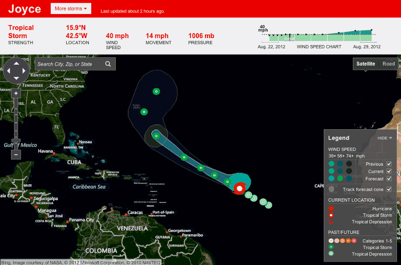
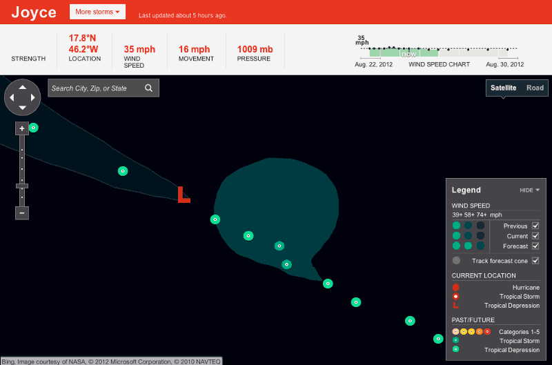
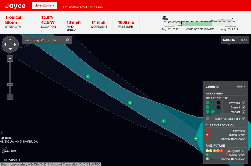
- We’ve made some improvements to the interaction that I never got to take care of in the previous version. The entire histogram (chart at the top) is an active thing you can roll over, for example; the previous version only popped the rollover when you were over the lines.
- The histogram and the map have a much tighter relationship now. If the whole hurricane path is visible on the map, you’ll see the whole thing on the histogram, and visey versey. Conversely, if you change the map so that 1/2 the hurricane is visible, you see 1/2 of it on the histogram. You can see this happening in the images below.
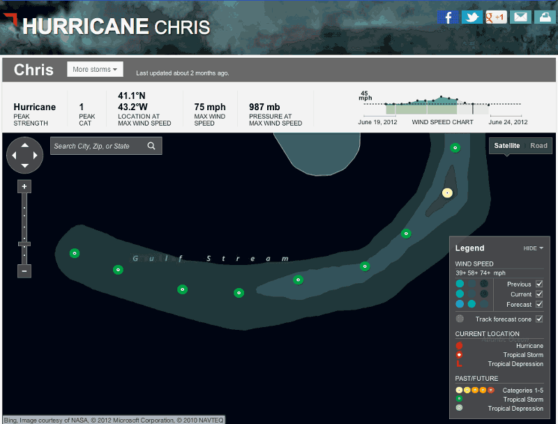
View Project: Hurricane Chris