A lot of what we do at Stamen is inventing things that haven’t been done before; pushing the technical envelope on something like scary cartography, or inventing new techniques to animate the effects of climate change due to global warming. It’s fun, and it’s definitely a big part of what keeps my creative juices flowing: Hey, look at that shiny new thing! Are they really paying us to do this? Awesome! But it can also be stressful, particularly when you’re planning your time and running the day-to-day operations of a studio, because fundamentally: if it’s new, it’s hard to figure out how long it’s going to take. We have various mechanisms for accounting for this (including taking a loss on a project because we just can’t help ourselves), but every once in a good while while we get lucky enough to take a second pass at something that smart people have laid a foundation for. This kind of work comes with its own satisfactions: polishing something to a high sheen, making it great instead of just good, really taking the time to pay attention to every detail and make sure that it comes out just right.
We’re proud to announce today, along with our friends at Yandex, a redesign of the online maps for Russia’s most popular search engine.
We have done the important stage of the project. We talked to designers, engineers and other smart guys during all time of the project. We achieved a lot of experience of mapping design.
For example, at the the begining of the project we collaborated with Stamen. These cool guys helped us pick main issue definitions, refine ideas, get important recommendations what to improve. We implemented it into final design.
What follows are some before and after comparisons of the various design changes we recommended to Yandex.
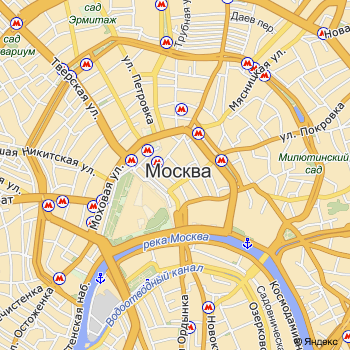
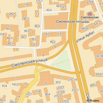
Many maps account for many different kinds of roads: freeways, business routes, on ramps, off ramps, service roads, residential streets — and show those roads as different kinds of strips on the map. We reduced the number of roads to three, greatly simplifying the display:
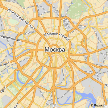
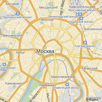
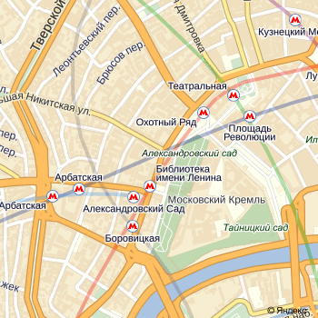
District names are always tricky to label; you’ve got to decide how take into account things like major railway stations, and how they’e going to interact with one another. These choices have been improved:
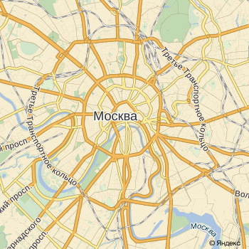
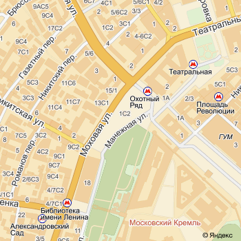
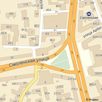
Zooming in a bit, we brought down the emphasis on the subway labels themselves, and made sure to label them for easy legibility:
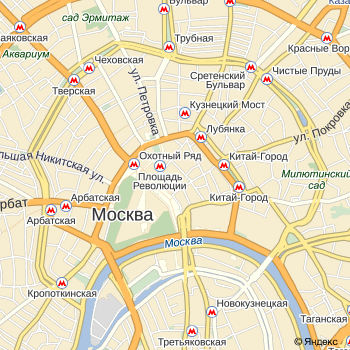
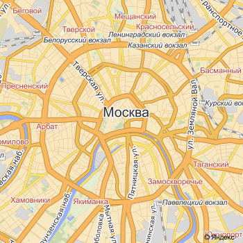
Zooming in further, we paid attention to the routes that the subway lines take under Moscow. Not having been there before, we needed to rely on our friends at Yandex for confirmation as to whether this looked right given insider knowledge of Moscow, but it turned out nicely:
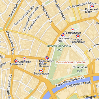
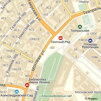
One more zoom level in and there’s enough detail for the subway icons to be colored according to which line they’re on:
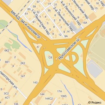
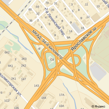
We did recommend a few new features, in this case one-way arrows indicating the directions that cars are allowed to travel in on different streets:
And finally we improved the rendering of freeway interchanges, which if you’ve ever tried it yourself, is no joke:
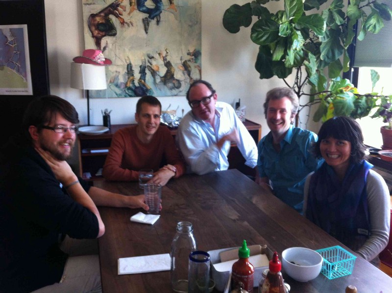
You can see the results for yourself at http://maps.yandex.ru/. And it’s generally a good sign when your client, in town from Russia, comes to visit. Thanks Andrey, Alexander, Julia and team Yandex!