
One of the great things about being involved with projects like twitter visualizations of the Olympics is being able to look back at an event that basically the whole world is paying attention to, and seeing the way that attention was focused at events that make their way into culture and our collective memory. Sunday’s game between the US and Canada, for example — the thrill of victory! the agony of defeat! It’s increasingly becoming possible to look at and measure the impact that these moments have on the culture at large.
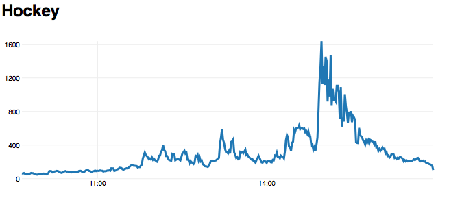
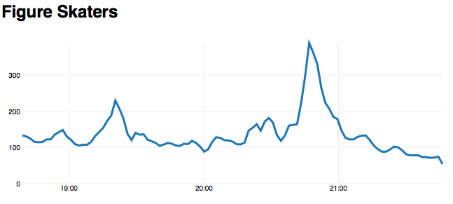
What follows are a series of graphs showing twitter activity related to the Olympics, at several seminal moments during the Games. Time is along the bottom, and tweets per minute (that we determined were related to the Games) are the vertical axis. Everything’s archived at the NBC Olympics site, and should be for a while.
Canada winning the Gold in Hockey:
China winning the Gold in Pair Figure Skating:
The world discovering that Luge contestant Nodar Kumaritashvili had died
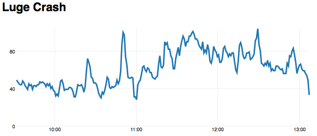
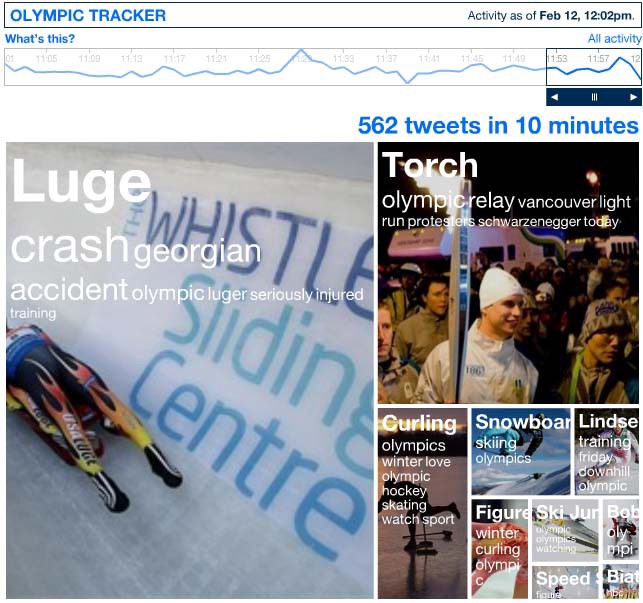
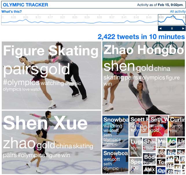
Each of these graphs links to NBC’s twitter tracker at the time shown by the graph. Note that these graphs omit any mention of “NBC” or “Olympics.” These terms were blowing out the visualization to the detriment of the live twitter coverage; including these words would make the numbers significantly higher.
Mike’s told stories about his experience at disaster preparedness camp, where you can tell who’s highest ranked in the room because he’s the one hunched in the corner poring over a spreadsheet, doing the boring grunt Excel work that no one else can be bothered to do. If this is true then Tom was definitely the top gun last night; I never knew that getting numbers to show at the bottom of a graph would take up a whole evening’s work. Thanks for the help!