
This post was originally published on stamen.com by Geraldine Sarmiento.
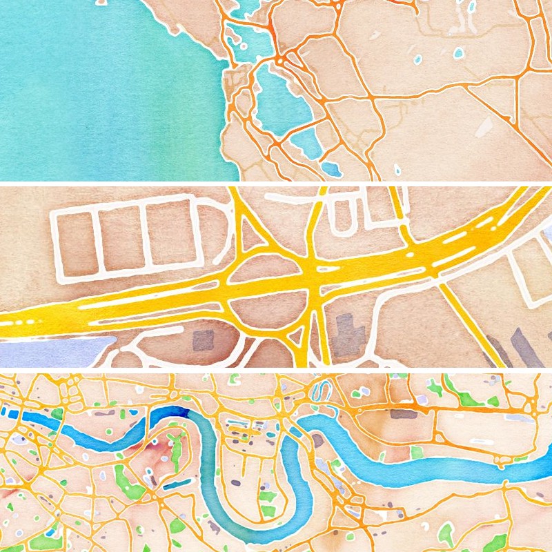
Following up on Zach’s post from yesterday and Eric’s post on Monday, here’s a peek into my process in creating watercolor textures for watercolor maps.
Below is a breakdown of the steps, a mix of the hand and the computer in all:
- Painting
- Scanning
- Making Tiles
- Cascadenik
Painting
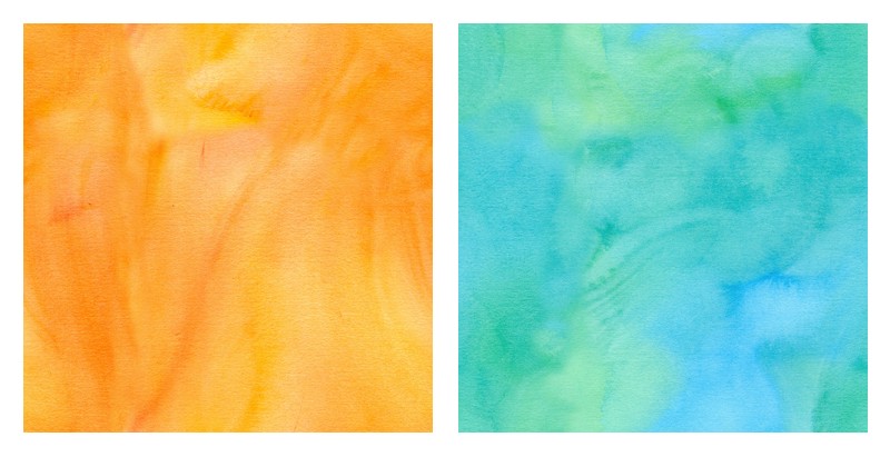
My first concern was color. I started painting even swatches of colors using a very wide flat brush with vertical strokes.
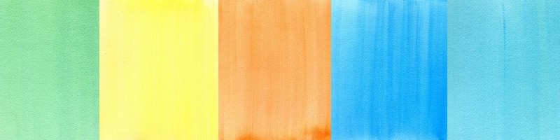
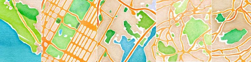
Watercolor Maps, February 13
We weren’t very happy with the results and moved the opposite direction.
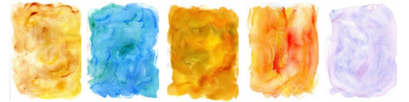
I went through many rounds of painting and testing, experimenting with other types of brushes as I went along, as well as painting on smooth to rough varieties of paper. For the final product, a variety of brushes and papers were used depending on the desired result. For example, the rougher papers added that extra texture needed for ground areas. It was fun to mix it all up to convey a variety of terrain. ( See my set of textures available for use on Flickr under a Creative Commons Attribution-NonCommercial license. )
The process of going back and forth from painting to the computer became a continuous cycle. Midway through as I became more and more familiar with the outcome of how the actual texture would appear on the screen when tiled, my painting process became more specific to achieve the desired texture, color, darkness, stroke, range of value that I wanted for each feature on the map.
For oceans, I painted a range of blues mixed with turquoise and violet.
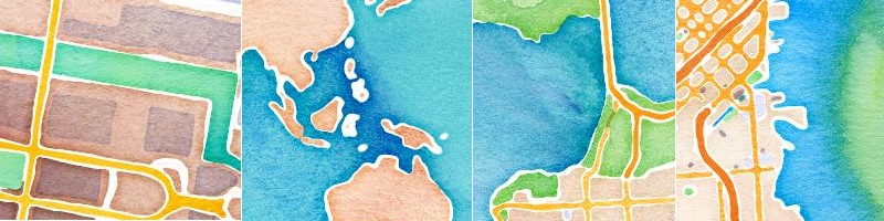
For parks, I mixed yellow greens, forest greens, muddy greens in dark and light ranges.
It was like this for every feature on the map.
Oranges, reds and browns for motorways with major roads fading in and out underneath.
Lavender-gray buildings.
Towards the end I was using original textures with no color retouching, Photoshop was mainly used for cutting seamless tiles.
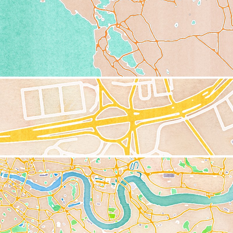
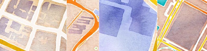
Making Tiles
The process of creating seamless tiles was just as painterly as the painting on paper. I quickly learned how to use that tiling feature in Photoshop and enjoyed the whole process of hiding the seams. Even at this step the desired color and texture was always in mind.
Some sample tiles below.
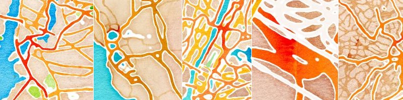
Watercolor Maps, March 2nd
Cascadenik
This is Zach and Mike’s domain. Zach and I would discuss and tweak qualities of line and darkened edges, which are just some of the filters he created for this mapstyle. He would set me up with the desired filtered effects leaving me to focus primarily on the textures. For the final product, a texture was created for each zoom level and for each feature of the map. So for example, parks have a green texture tile for each zoom level and so on. This worked particularly well for zooming in and out of water bodies since it conveys the movement of the oceans.
Enjoy ^___^