
Last year, we were challenged by Esquire magazine to re-imagine a map of America to depict the country in a new light. That challenge has resulted in our first new work for this year: a piece called WHERE DOES THE MONEY GO? You can read Esquire’s article on the project and see the other contributions.
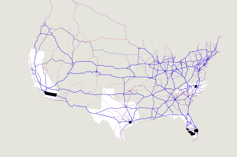
By combining migration data from the Internal Revenue Service (IRS) with route information from MapQuest Open, we were able to show population movement alongside income flow, resulting in thousands of different images of the 48 contiguous US States, organized left to right by county-level income lost to gained.
Having just joined Stamen, this project was an excellent first crack for me for a few different reasons: 1) The project passed around the studio like a plate in a kitchen, with different people preparing different parts of the whole; 2) I was able to get a sudden, detailed look at the geography of the USA, useful given that I’m Australian! Did you know there are 3,143 counties? Or that Michigan looks like it’s cut in two? 3) I witnessed some serious cartographic, javascript-y, and data massage-y dexterity, and 4) I’m finally on the inside (mwahaha!), so was able to participate in the delicious evolution of a project, watching sketches being made with data, being tossed or surviving, being refined and perfected.
To help prepare this post, I asked around the studio to uncover any insights or stories people found as they worked on the project. It’s these observations that mould the shape of the end result, but often lay silent once the project goes live. This is something I hope to deliberately listen to and share in future projects at the studio, because I think it’s a glimpse into the minds of the craftspeople here.
Eric was struck by how this map can show you the USA from so many different angles. Noticing that different people use different routes to travel across the country, he remarked that “if you live in one of these places where a lot of people are moving into, you’re probably around people from a lot of different places, so your map of the country is really different.”
As I moved the slider from one side to the other, it became obvious how migration across the country was oddly parallel to the movement of money. At each outer edge, people seem to travel further, and in the middle of the country, paths from old to new home seem shorter, and the map starts to break into more abstract archipelagos.
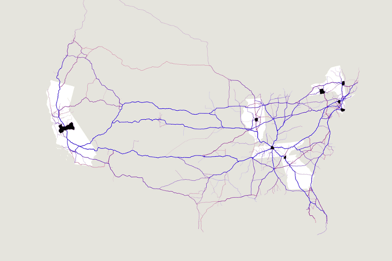

At the mid-point, where in some cases neither income nor population shifted, the map is quiet:

Mike picked up on the fact that most of the big cities in the US — Los Angeles, Chicago, New York — are in counties that lost the most income overall. “In a way, these cities aren’t really losers at all. It’s more like they’re the major exporters of the country.” When we use language like loss or gain, it implies some kind of failure, but in this case, we’re describing money movement, not necessarily the “biggest losers.”
There were a couple of stories that stood out for me. Florida appears to be gaining both income and population. Of the 80 wealthiest counties on the scale (that’s the top 2%), 19 of those are in Florida, and the average income per household moving there is about $53,000. The national poverty threshold for a four-person household in 2009 was $21,954. (The source for that number is this census.gov “Poverty Thresholds by Size of Family Unit: 1980 to 2009” PDF report.)
I also spotted Orleans Parish in Lousiana, where Hurricane Katrina hit so hard back in 2005, but was experiencing substantial growth in 2010, with an influx of $146 million in income, and 10,594 new souls.
All in all, a great start to an exciting year. Enjoy exploring this different America!