We’ve been working with the smarties and do-gooders at Climate Central for the better part of a year now, designing and programming and planning and rendering and otherwise embiggening the idea of a map that could bring the reality of climate change to people’s doorsteps. As of last week, the project is available athttp://sealevel.climatecentral.org.
We started with two ideas:
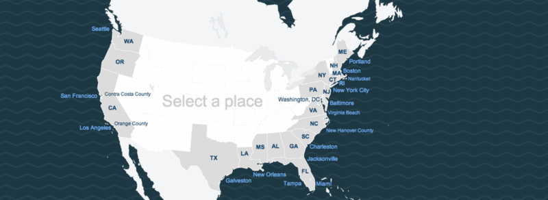
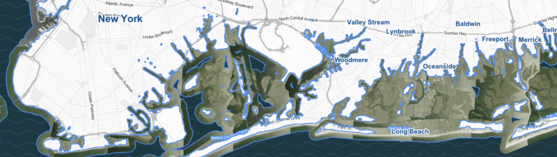
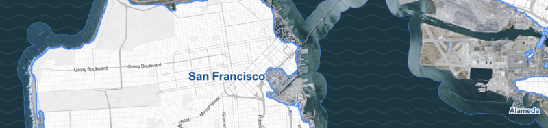
- most maps of sea level rise are generic. How could we bring home the idea that this isn’t about “those people” but about you and your neighborhood? and
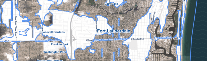
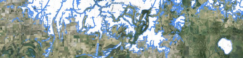
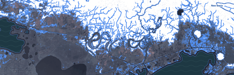
- most maps of sea level rise are about the shrinking land. As a percentage of total land area, these always feel small and unsatisfying. Why don’t we focus on the land that’s going to be underwater, and try to make it clear that this is the land that we’re going to lose?
The context for this work is: while there are a great many papers, scientific studies, meteorological surveys and other things that fall under the rubric of things that normal people accept as true, there remains a persistent and nagging unreality to the idea that, in something like a normal human timescale, we’ll see and have to reckon with large-scale changes to the world as we know it. It’s one thing to say “the world is changing and all of us will have to deal with it.” It’s quite another to say “7.6% of the people and 9.1% of the homes may very well be underwater in Boston, and so you’ll need to start thinking about that pretty damn soon, is that cool?”
The political reluctance is certainly predictable — telling people about a long-term existential threat like this is just not a job that your average politician, elected for a term of a few years, may want to tackle. For that matter, it’s a hard subject for the rest of us to think about intelligently.
Although the risk of coastal flooding is slowly worsening year by year, it’s true that the worst consequences of sea-level rise, if they ever materialize, are still a long way off. Most people simply have trouble contemplating risks to their great-grandchildren. We’re a lot more interested in our own skins!
(As proof, I will tell you that two Times editors came by my desk this morning wondering about the near-term risks to their homes in low-lying areas of Long Island.)…
The Web site of Climate Central, where these sea-level studies were mainly done, has a great deal more useful information, including the ability to search by ZIP code and get a sense of your own risk.
(Justin Gillis, The New York Times)
Which is to say: if you’re doing science and you want to have an impact on public discourse, pubish a rigorous scientific paper in the New York Times, and no mistake. But also: let people search for their own zip code, because what’s personal matters.
Also: when the New York Times puts you on their front page, a couple dozen other news outlets do the same, and both Al Gore and Tim O’Reilly link to your stuff, it’s probably a sign of two things: a) the alpha nerds are paying attention, and b) you’re about to have a big traffic day.
At times on Wednesday the Climate Central computer servers were overloaded, so if you have trouble getting the search to work, try again a while later. (NYT)
Ahem.
View Project.