
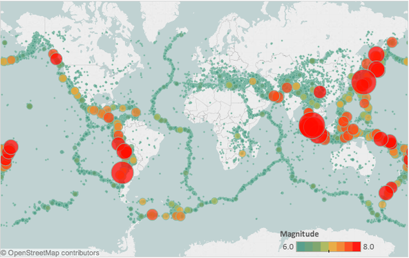
Stamen has long aspired to make it easier for people everywhere to visualize data, particularly on and with maps. In our recent partnership with Tableau, we’ve helped to improve a tool that does just that. Tableau’s latest version, 8.2, comes complete with a mapping suite designed by us. Suddenly it’s that much easier for people all over to make beautiful maps with their data.
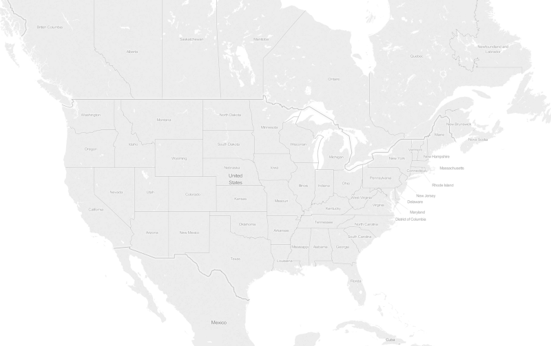
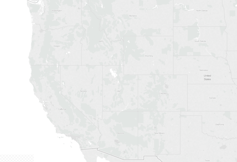
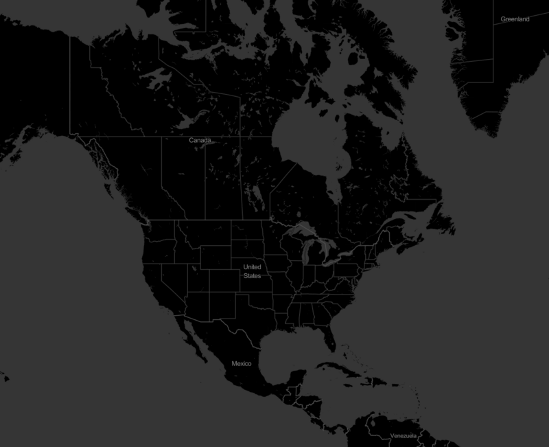
The maps come in three varieties: light, dark, and blue water.
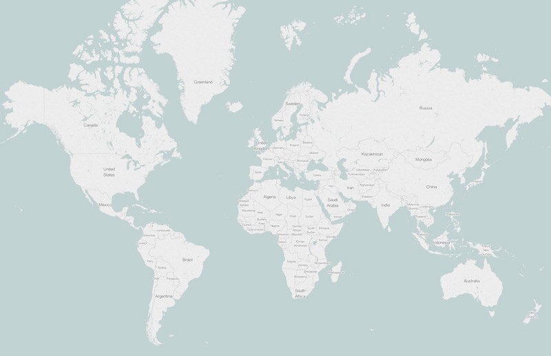
Light maps are meant to be as subdued as possible, using hints of terrain to provide texture.
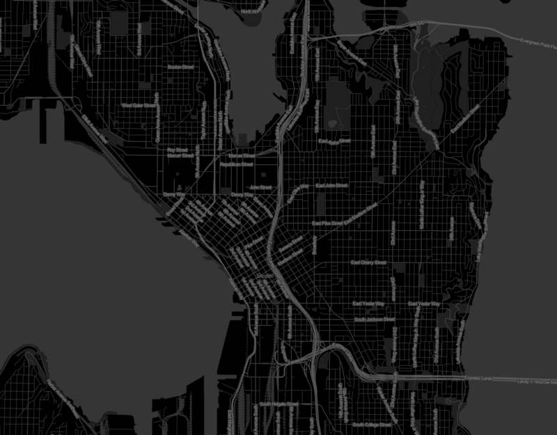
The dark maps are designed for bright colors, barely hinting at the outline of country borders.
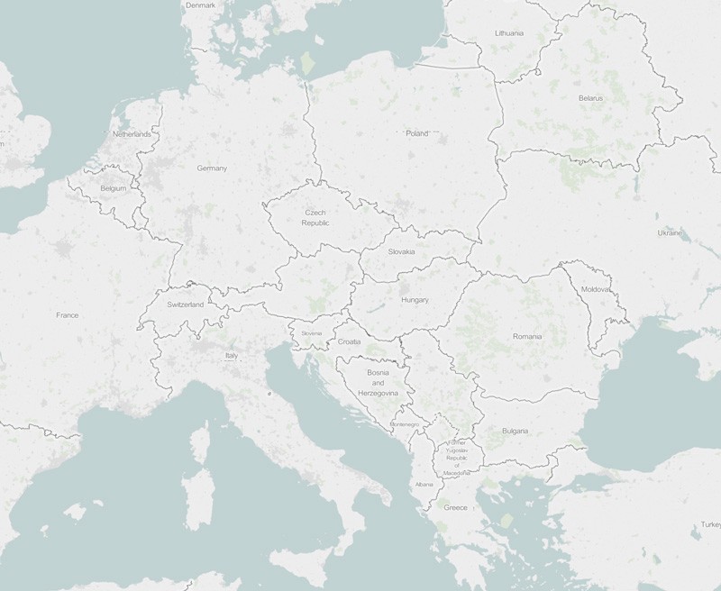
Blue Waters are meant to provide a similar subtlety as the light maps, only with more natural tones.
Our goals for the project were:
- A clean, modern look and feel.
- Consistency across the three maps. They should be strong enough to stand alone but work together as a set.
- That the maps be beautiful in themselves, but primarily built to display data.
Finding the right shades for the background, shades that work well with all of Tableau’s standard palettes, brought a level of science to the color process that we had simply never practiced before. Typically Stamen’s approach to color is an intuitive, experimental and evocative one; color theory is present but not primary. Tableau’s maps, in contrast, required rigorous testing and iteration for even the most incremental tweaks in order to retain contrast. Tableau’s Visual Analyst, Maureen Stone, was our guide deep into the world of color science. In doing so, she taught us more about color calibration than we ever would have thought to learn. We now know that color is not just about trusting the eyes; it’s also about trusting the numbers. The numbers are what allow a wide range of colors — important for data layers — to have consistent levels of contrast and pizazz.
This connection of art and science is part of what made the project come out so well. The resulting map design system has a consistency and intensity to it that we haven’t seen with any other out-of-the-box analytic tools.
We applaud Tableau’s use of Leaflet and OpenStreetMap for creating and presenting these maps. We’re proud every time we can help one of our clients make the switch to designing with open data.
Ready to make lovely Stamen maps with Tableau and learn more about the release? Make your way to 8.2!
Read more about the Stamen + Tableau collaboration in The New York Times.