
Climate change, though we know it’s there, is a hard thing to see: it’s slow, it’s invisible, and if you don’t know what you’re looking for, then you might not even miss it once its gone.
Birds, however, are often hard to miss: they can be loud, bright, beautiful, strange. It turns out that by watching where their flight ranges are shifting now, we can get some idea about where they are going, which points to some likely patterns of climate change and how it will affect an ecosystem in the not-so-distant future.
This is precisely the kind of data that the Audubon Society has been collecting extensively about North American bird flight range changes, and in this project we have helped them to visualize it. Working with data from “the broadest and most detailed study of its kind,” the visualizations we’ve made together, with a lovely site designed by our friends at Mule, collectively comprise “the closest thing we have to a field guide to the future of North American birds.”
Hundreds of thousands of observations (drawn from the long-running citizen science projects the North American Breeding Bird Survey and the Christmas Bird Count) combined with sophisticated climate modeling create these predictions of where certain birds will be, when. Suddenly we have a clearer idea of where each specific bird will go, not just that they will all travel north. [Waves hands to indicate broad area of northernness.]
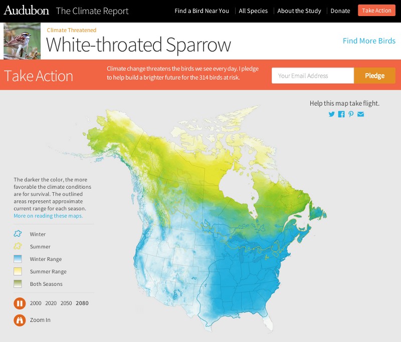
The dataset for all 314 birds contained both summer and winter range predictions. Our main challenge was to make this data engaging for the public. For us, this meant making the visualizations easy to understand, as well as easy to share.
Realizing that individual animations would make it easiest to see the change, we decided to make a GIF for each bird.
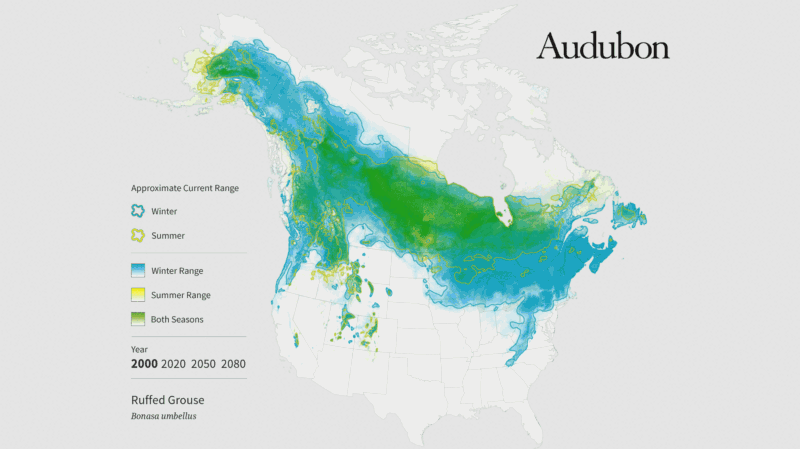
Not quite like that. Rather, for each year in our dataset — 2000, 2020, 2050, and 2080 — we created a shifting cloud of movement showing the probability of where the birds’ range is now and where it’s likely headed in the future. Yellow represents summer, blue winter, and green is a combination of both seasons. The yellow and blue outlines mark the 2000 summer and winter ranges to make it easy to see how things change over time.
We’ve been enjoying the wispy, smoky detail that comes through on the map…as much as anyone can enjoy maps about such massive and potentially disastrous changes for so many animals. Just look at the beautiful detail in the Rocky Mountains in the maps for theNorthern Shoveler or the Ruffed Grouse!
To create these maps, we wrote a script against Tilemill, one of our favorite cartographic styling tools. In the end, we rendered more than 1200 maps (four years of data for each of the 300+ birds).
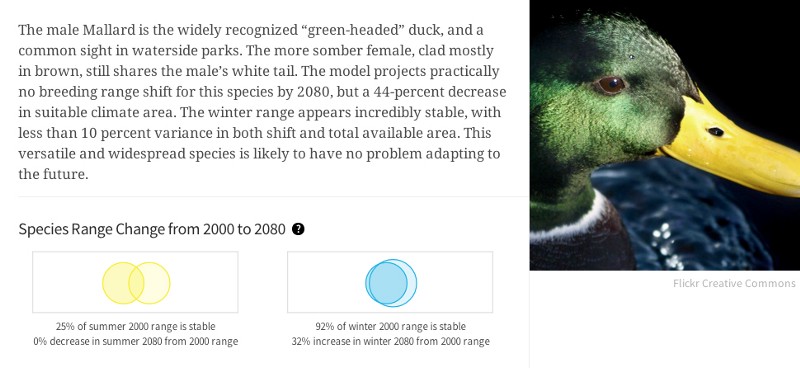
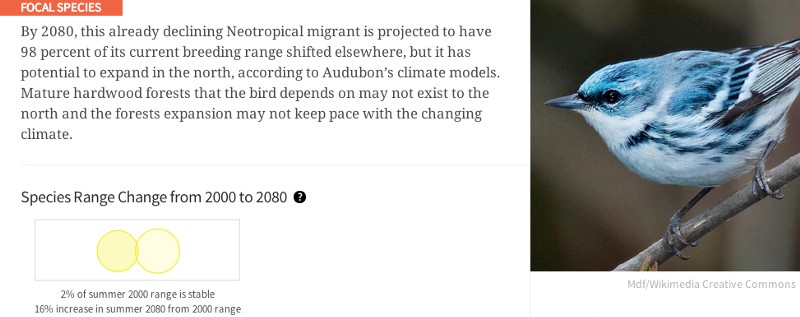
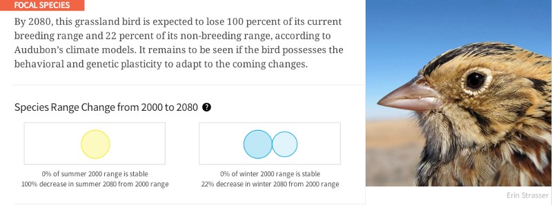
In addition to the maps, we made two Venn diagrams for each bird as well. These overlapping circles show both the area of the potential 2080 range, but also how much the current range overlaps with the future range. That’s crucial. Some birds (like the Hooded Oriole) might have big increases in theoretical range, but if there’s no overlap, we can’t be sure whether the bird can take advantage of that new range.
In some cases there is a lot of overlap, like with the Mallard:
And in some cases very little or none, as with Allen’s hummingbird:
…and the Cerulean Warbler:
…and Baird’s Sparrow:
And so many more.
As sobering as this work has been to create, we thoroughly enjoyed working with both Mule and Audubon to create it.
To learn more and take action, visit climate.audubon.org. Find your favorite map and share it with your friends! Or better yet, go outside and find a bird that you might not see again in the next 20–80 years.
A tech detail of the project is coming soon!