
I’m excited to announce the start of a new kind of project for Stamen, working with the geolocation experts at Quova to explore the opportunities for visualization of their truly ginormous dataset — geographic information on all of the IP addresses on the internet.
What’s new here, for us, is that we’ve agreed to publicly blog about the project; not once it’s finished, but as we move forward and develop new ideas. Mike has done this kind of thing before, blogging about crimespotting as it was being developed, but it’s a harder thing to do with paying clients who generally need to be the first to announce to the world that a project is going live. So I’m really pleased that Quova’s agreed to make this process public. Let’s see how it goes!
Generally we divide investigative data visualization projects into three distinct phases — explore, build and refine. The idea is that you start off by wrapping your hands around the data, getting a feel for the flow and rhythm of it, and you base a project around what you find there. This approach, we hope, leads to projects that feel natural and deliberate and appropriate to the data. The alternative — coming up with an idea ahead of time and then shoehorning the data into it — runs the risk of the project feeling like a square peg being hammered into a round hole, and nobody wants that.
In this case we’ve separated out the initial investigation (“explore”) into its own phase, with some hopefully interesting results to show. The idea of this initial investigation is not so much to figure out what the answers are, but to get a good sense of what the questions might be, and we do that by building some initial representations of the data and seeing what kinds of results come out. Mike’s said more about this in a talk at User Research Friday, notes here, talk here. What we’re trying to do is to come up with a basic metaphor for the project, and we do that by making stuff.
And so: back to Quova, and ginormous datasets. What Quova can tell you, basically, is where all of the computers are. The dataset is somewhere in the neighborhood of 4 billion separate addresses, changes all the time, and is of intense interest to companies like banks, online stores, newspapers, and — wait for it — internet gambling companies. For this last group, it’s important for them to understand where people are logging in from, since different places have different laws about it, both in the US and in the UK (where this dataset comes from).
We talked about maps, of course, but that seemed too…pedestrian a thing to lead with, too obvious. You need to have some style with this work, y’know? We wanted to get a sense for the overall flow of things before making blinking maps (although I’m sure we’ll get to those eventually). So as a first stab at understanding the data, Tom & Aaron’ve been building on Lee Byron & Martin Wattenberg’s work on streamgraphs and continuing their investigation of solr as the backend, and pointed that at gambling data from the UK in early June 2010.
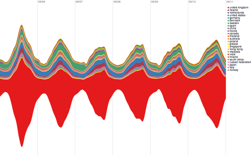
Here’s a slice through what we found. All of the graphs are over the same time period; the actual values’ve been removed, so each of the graphs shows a different total volume of lookups, to protect the innocent. It’s important to note that, since these are streamgraphs, volume is represented by the total vertical size of each section along the graph — some people have told me that they read these as positive and negative values along a central zero-axis. But more on that later.
All countries:
We start out with all countries, and while Ireland, Denmark, the United States and other countries are all represented here, by far the largest country (red) is the UK, which makes sense as these are lookups for British gambling sites.
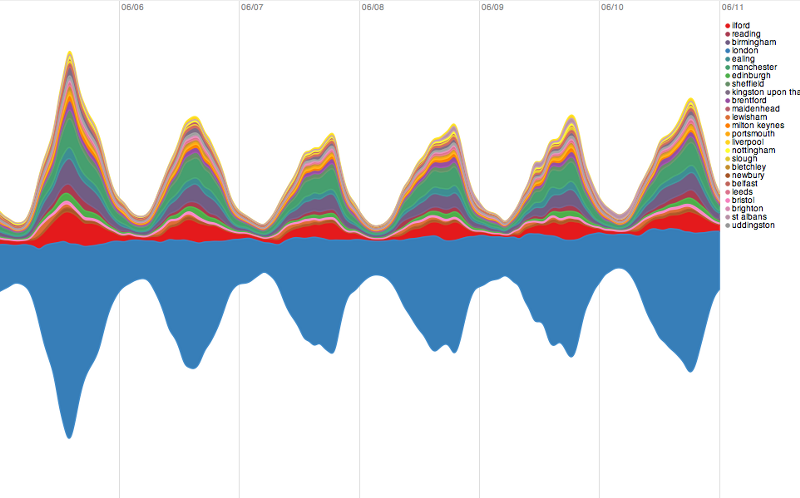
UK only:
Stripping out all countries besides the UK lets us facet the search on the different cities represented, and again we find one clear winner; in this case London (light blue). The other larger cities in this graph, Manchester (green) Ilford (red) and Birmingham (purple) all show the same kind of day-to-day similarity, where there’s a low point some time after midnight (where the lines are), and a peak in the early evening, presumably when people are at a pub or at home.
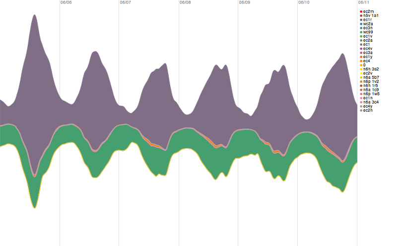
London only:
And dialing all the way down into London, where we can facet on postal code, shows us that a single post code — EC1, basically the center of London, the City, where the financial heart of the Capital lies, is responsible for a huge portion of the daily spike in gambling lookups. The data doesn’t get any more granular than postal code, so this gives us a pretty good indication that the consistent daily spike in worldwide gambling lookups (by the companies in question) are coming from centrally-located gambling centers concentrated in the center of town.
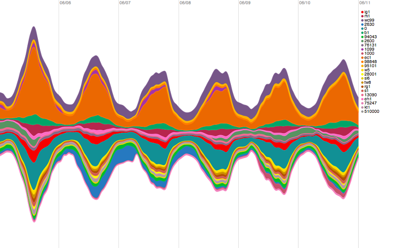
London vs. the World:
So armed with that insight we can pull all the way back out to all of the countries in the world, slice the world by postal code, and pick out pretty easily (in orange this time) EC1’s role in making that early world-wide graph twist and shout:
There are lots of things to say about these — first among them that these are early early sketches and prototypes and have intentionally had lots of rough edges (like color choices) left un-polished so that they’re not regarded as finished designs — but the main point I think is important is that these are investigations, steps in a process of discovery. Exploratory data visualization isn’t so much about finding the answer to a question as it is discovering what the interesting questions to ask are. What is there to find in a dataset as rich and varied as the one owned by the people who know where all the computers are? And it’s not so much a question of picking which visualization to use to get the maximum insight into a pile of data, but of developing a literacy in using visualization as a language to have nuanced conversations about the world. There are a number of other interesting conclusions to be drawn from Quova’s dataset that are worth pulling out, but this is getting long so I’ll save those for another post.
Tom gave a talk at ETech a few years ago where he outlined some common assumptions that the studio has about data visualization and recommendations for how to do this kind of work. One of these days we’ll get him to publish them all (they’re really good), but in the meantime this one feels appropriate:
(19) Start and End With Questions
“Traditional statistical charts can be a good first step to generate questions, especially for getting an idea about the scope of a data set. Good questions to start with include “how many things do we have”, “what do we know about each thing”, “how do the things change over time”, “how many of each category of thing do we have”, “how many things are unique” and “how many things is each thing connected to”. I don’t believe that any visualization can answer all of these questions. The best visualization will answer some questions and prompt many more.”