
Back in December, we launched a new map for the Golden Gate National Parks Conservancy. The goal was to help people get to the parks and once there, around them, and to create a framework for Parks Conservancy staff, volunteers, and partners to add additional data and content as needed. At first, custom cartography wasn’t even on the list, but in hindsight, it really made the project.
Here’s how it went down:
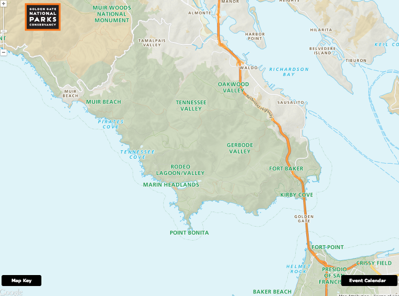
The project kicked off with a few key goals; at the top of the list was increasing the use of transit to get to the parks. We quickly realized that this constraint meant using something that both was familiar and incorporated great transit data. Stylistically, we wanted to allude to the classic maps from the National Park Service (NPS)–ample terrain, lots of green, and bold black iconography.
By National Park Service [Public domain], via Wikimedia Commons[/caption]Google Maps has some of the best transit data, and its usual look and feel isn’t far from that of NPS (not to mention being immediately recognizable due to its overwhelming popularity). Plus, Google provides tools to customize their maps to fit custom color schemes. With all roads leading to Google Maps, that’s the initial direction we set in on.
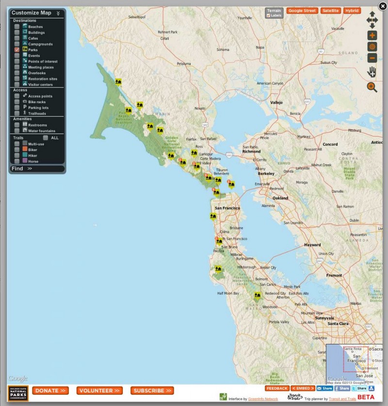
This assumption was turned on its head, however, when we began to incorporate the Parks Conservancy’s trail data. It turns out that trails are highly entwined with roads, at least in the Styled Map Wizard. Replacing Google’s trail data with data from the Parks Conservancy meant hiding some of Google’s road data, which in no way would help anyone to make their way to the parks. We also realized that by using a Google base map it would be more difficult to specifically highlight areas managed by the Parks Conservancy and that the points of interest (POI) baked into their base layer (some of which we wanted, but not all) distracted from the parks.
This is when we realized that we needed to go custom. There was no other way we could incorporate the variety of datasets from the Parks Conservancy–trails, trailheads, overlooks, parking areas, bathrooms–without doing that clunky, terrible thing where you just pile a bunch of data over a general purpose map and hope the user can just create clarity on their own. *shudder*
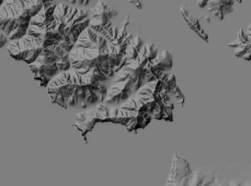
Going custom meant working primarily with OpenStreetMap (OSM), our go-to source for free and open source spatial data. There’s a ton of data there, but we were still missing terrain, which was going to be critical in representing the lovely shaded mountainous regions throughout the Golden Gate National Recreation Area (GGNRA). We’d been given copies of some high-res elevation data produced by the ARRA Golden Gate LIDAR Project (a collaboration between the US Geological Survey and San Francisco State University) but realized that processing and using this data would put us way over time and budget. So we went with USGS’s lower resolution National Elevation Dataset (NED) (we also use it for Terrain on maps.stamen.com), which provided the soft, rolling texture we were going for.
The end result looks very familiar–similar road coloration and widths–and using the Google Maps API for functionality, it works like a Google map. You might not be able to tell the difference immediately, but we hope you’ll appreciate that all the bathrooms are both clearly represented on the map as well as being routable when you need to find one in a hurry.
As simple as the map looks, we used a wide variety of data sources under the hood:
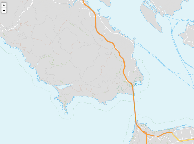
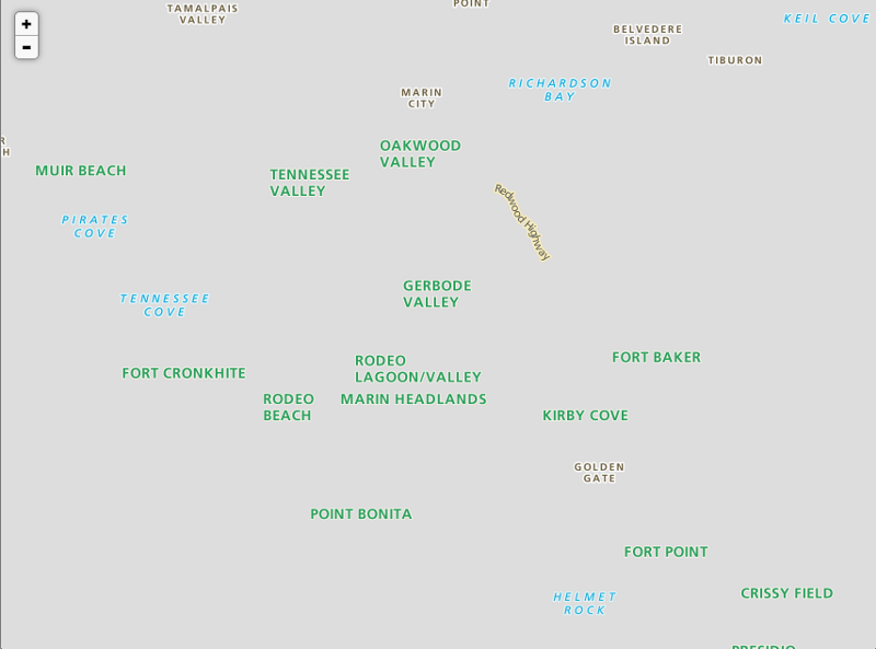
- OSM, for the transportation network, most place names, and secondary green areas like playing fields and golf courses. We made some edits around the Presidio and Marin Headlands to correct some one-way streets and inaccessible sections of road.
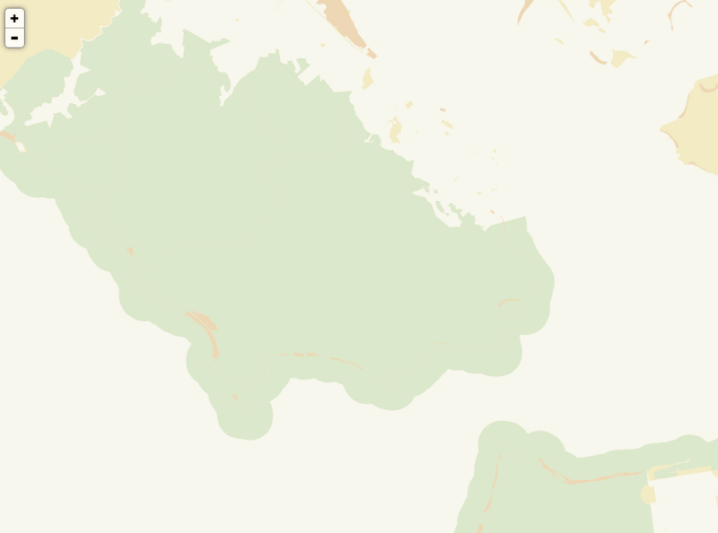
- The California Protected Areas Database (CPAD), for all open space areas (federal, state, county, and municipal parks). We drew these before adding NPS boundaries to provide texture and context without distracting from the map’s primary focus: the Golden Gate National Recreation Area.
- GGNRA areas were sourced from NPS.
- Coastlines and water features were drawn using using data from the National Hydrography Dataset (NHD).
- Transit and Trails provided all of the data for the trailheads and trips (such as Meander in Marin, visible as an overlay), which are curated by users of T&T, including Michael Norelli and other members of the Parks Conservancy staff.
- The GGNPC and GGNRA GIS departments provided trail alignments and names as well as notable features present in the GGNRA (bathrooms, overlooks, cafes, etc.).
- All additional data came from the Parks Conservancy, via their GIS lead (and wonderful collaborator) Michael Norelli. He also sent us the park names, campgrounds, overlooks, restrooms, POIs, trails, and building footprints throughout the GGNRA.
We used TileMill, PostGIS, GDAL, and other tools to combine these datasets into a coherent whole. In order to facilitate updating and repurposing, we created four layers and baked them together using bits of Map Stack. Here they are from bottom to top:
1. The background layer, containing park and protected area boundaries, beaches, and other solid polygons.
2. The processed terrain layer, combining hillshades and slope maps. At 60% opacity, it creates subtle shadows of terrain, indicating the natural landscape without obscuring the features most important to the Parks Conservancy.
3. The feature layer, containing water, the transport network, building footprints, and boundary lines. Land is transparent, allowing the background layer to show through.
4. Labels are rendered separately, giving us the ability to sandwich dynamic data (which we didn’t end up doing) and provide interactivity (using UTFGrids).
Here’s how it all stacks up:
In the few months since launch, we’ve had lots of compliments (thank you!) as well as some questions. Many of them were about cartography, and have been answered above (we hope). Here are some more:
Did you have to create your own database?
Yes we did. No, it has not exploded yet, and we have Fastly, Heroku, and Amazon Web Services to thank for that.
With so many data layers, were you able to do any rapid prototyping?
Yes. Once we loaded the data into PostGIS, we used a combination of QGIS and TileMill to explore and style the data. Once we had a rough look and feel, we split the layers out (as above) and used Map Stack to introduce and tweak the terrain layer.
Why not use satellite imagery?
Great question, and we thought about this one a lot. In the end, although the extreme detail would allow for people to see the natural space in great detail, we would have lost the clarity we were going for.
What parts of the project are going to be open source?
Although we’d like for all of it to be, we’d rather purposefully release smaller chunks of documented, organized code than everything all at once in all its chaotic glory. With that in mind, the first things you should look for are:
- A Transit & Trails library (for Node.js) and command line tool — used for trip and trailhead importing
- A tool that merges GeoJSON files — used for trip and trailhead importing
- A tool to import GeoJSON into PostGIS (using PostgreSQL’s JSON data type) — used for trailhead importing
- A tool to enrich GeoJSON using the MapQuest Open Elevation API — used for trip importing
- A tool to convert SVGs (made with D3) into PNGs — used for elevation profile generation
That’s all we can think to tell you about the cartography for now. Have more questions? We’d love to hear from you.