View Project
There’s a thread running straight from Newspaper Club to this project. We’ve got all this marvelous infrastructure — newspaper printing presses and everything that goes along with that, like delivery trucks, ink distribution systems and pre-press services in the one example, and phone boxes, land lines running underneath the streets and advertising services on the booths on the other — and we’re not really using it anymore. Newspaper presses are falling into disuse, and apparently British Telecom don’t even bother to repair broken phone boxes anymore. My working life started in earnest when I was a bicycle messenger in New York in the late 1980s, and all of that business was done over beepers and the phone booths of Manhattan, so I’ve never really quite gotten over this idea that there’ll come a time when there simply aren’t any public phone booths on the streets. But it’s clearly on the horizon, as is the death of the physical newspaper. So the idea of doing something with all this infrastructure while it’s still around is really appealing to me, and I continue to be impressed with the guys at RIG for bringing these kinds of issues to the fore in a way that’s both eye-opening and commercially relevant.
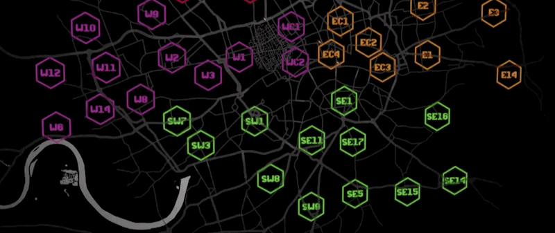
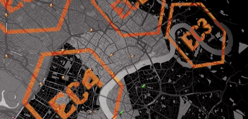
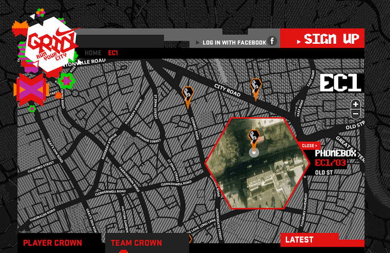
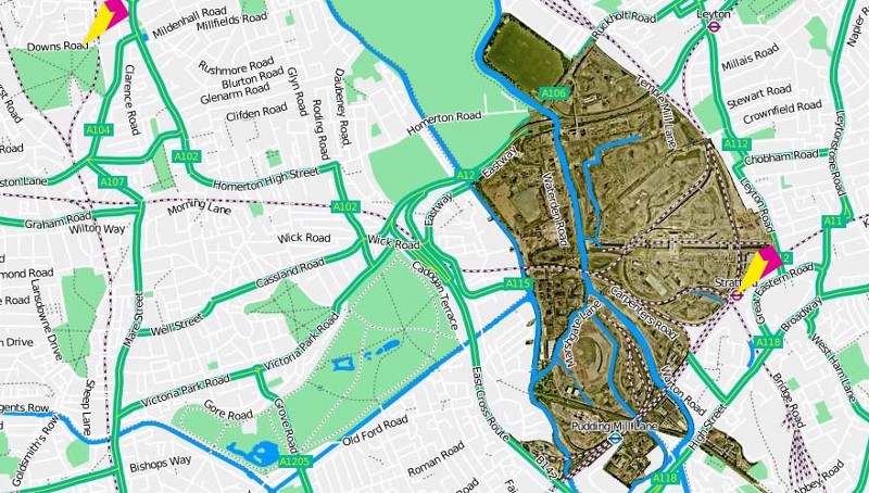
In any case there are a few specific parts of the project to talk about. The background maps are a custom tileset designed by Geraldine using data from Open Street Map (and credited properly as such, this time) and generated using Tile Stache.
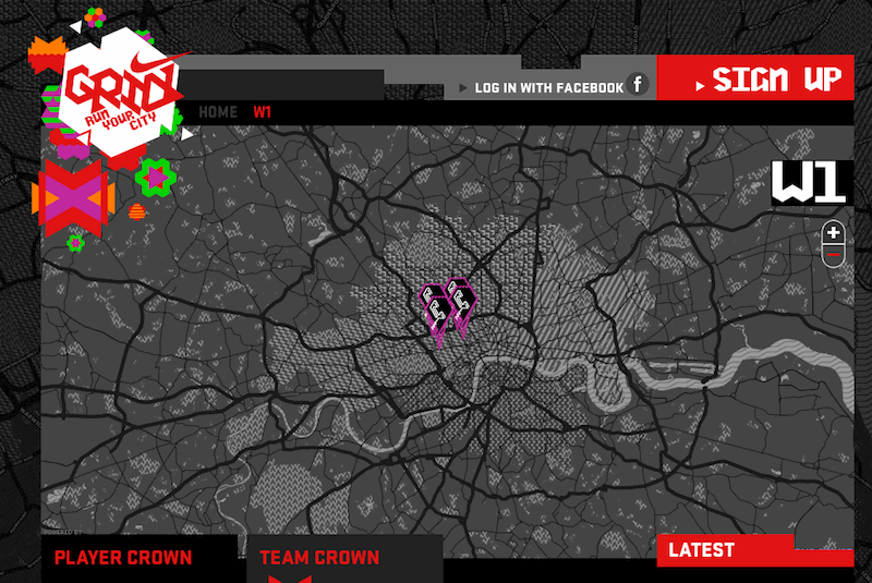
AKQA put together the snazzy interactive map that uses the tiles, combining the designed street tiles in combination with Google’s satellite imagery…
..with results that are eerily reminiscent of satellite/street combination maps that we made for the London 2012 Olympic and Paralympic Games:
We’re also pleased to be working with Ryan Alexander again, he’s been doing the 3-d visuals that are driving the in-game data visualizationsthat Nike are publishing for the duration of the race:
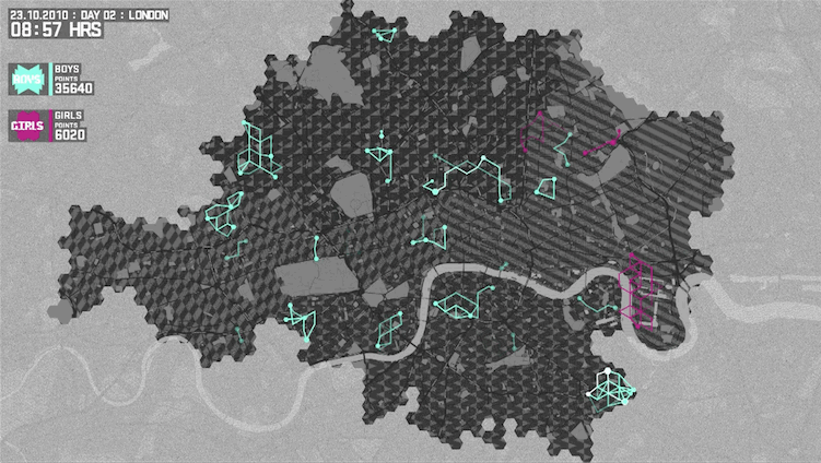
This last bit deserves a final point: W+K are taking each day’s race data and publishing daily updates highlighting various aspects of the race. Today’s video isBoys vs Girls, showing the relative points and badges etc. accumulated by boys vs. girls over the course of the day. It ends with a “get running, girls!” message, and I love that data visualization is being used as a way for a brand to tell a story, in something close to real time, in a specific way tailored to the events on the ground: