
This is my first post on our new Citytracking project, which is being supported by a grant from the Knight News Challenge. We’ve been working on it for a good part of August.Thus far it’s been primarily talk and thinking and writing, working on the overall structure of the project, trying to get a handle on what a two year project intended to change the way people talk about cities feels like. I think that it’s OK talk about the very early stages without having much other than thinking to show — my friend Teru Kuwayama (more him later), who also won a grant, is writing about getting ready to go to Afghanistan, and while there’s certainly no comparison between Citytracking and what he’s getting himself into, I feel good knowing that other grantees are talking about their projects in the very early stages of them.
I should also say that it’s important to note that it’s really the whole Stamen team that won the award, and not just me: while the award announcement lists “Eric Rodenbeck, Stamen Design” as the winner, I’m mainly there to represent the group whose collaborative work has made the grant possible.
In any event, Stamen projects tend to be somewhat more bounded than this, both in time and ambition, having to do with a specific and bounded dataset or problem domain. Perhaps more importantly, for projects of this scale, there’s almost always a specific client. This time our client is us — and we can be pretty demanding 🙂
So one thing that’s happening is that Geraldine’s starting to think about logos:
And the studio’s been meeting regularly to talk over some options, plan this fall’s conference, and so on:
There’s quite a bit we don’t know. What we do know is that Citytracking is intended to be a public, open source project that takes data about cities and makes it more legible — more beautiful, interesting and accessible. We know that we’re intending this project for three audiences: cities, journalists and the public (including businesses). And we know we want to make the project 1) so simple that regular citizens can get involved, 2) robust enough that real analysis can happen, and 3) interesting enough that children will play with it. Along the way we’re planning to release server-side codebases, mapping algorithms, managed datasets, APIs and API specs, and new views on data. And finally we want to do this work in public, in close dialogue with our audiences, so that we know we’re not going down rabbit holes and doing work that’s not valuable.
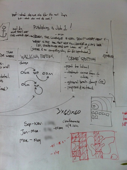
It’s this last bit, the public bit, that helps turn the problem into something that can be tackled and keeps it from becoming overwhelming. The question is not: What do we do for the next two years? but rather: What do we do next? The important thing is to do it in public, and listen to what people have to say. One important thing that has come out in our meetings about it is the idea that this project is not “the map that ate the world” — the end all be all project that is going to satisfy the need of every non-profit that wants to map their spending over time. The project is: Here’s some work, grab the code, the license is cool, don’t worry about it, use it, go ahead and publish your stuff. So in that vein we’re hoping to be as transparent as possible — and there’s the little matter of the grant requirement that we blog about it every couple of weeks to keep me motivated.
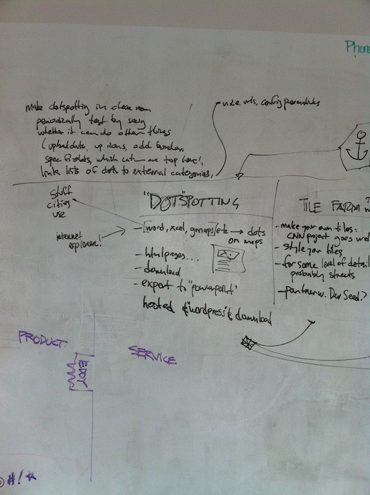
Our ideas so far have fallen into four categories, written in outline on the whiteboard sketch from our latest planning meeting above: Walking Papers v2, Crimespotting v2, Tile Farm, and Dotspotting.
Walking Papers v2
Mike has been extending Walking Papers for some time now, making it work with aerial imagery in 2009 and under stressful conditions in 2010. There have been a few other interesting uses of the project: We’re currently working with the Art Institute of Chicago on bringing the project to the Institute for a show in early 2011, potentially involving kids from the Institute’s Education department, and Sarah Van Wart at the I School in Berkeley has been using it to with kids in Richmond, California on imagining a different future for their neighborhood. Both of these instances suggest that there’s value in a version of the project that doesn’t require the information being imported back into Open Street Map or demanding the technical expertise of knowing what to do with a github install. What if the service allowed you to keep the information you add to it on the Walking Papers site?
Crimespotting v2
This one seems like a natural for the grant; the notion here is that we take what’s already been done on the Crimespotting project, both from an interface and a technical perspective, abstract out the feature set, and make it open source. Basically:
- Port it to HTML (probably using Polymaps, since there’s already an example of crime in Oakland on the site).
- Abstract crime out of it: pull out references to crime and make it a framework for mapping trees, fire engines, whatever. This is a tricky one, mainly because it’s not simply a question of replacing ‘assault’ with ‘acacias.’ Even the FBI’s Universal Crime Reports, intended to give municipalities a simple and structured way of talking about crime, starts to get unwieldy if you start to include things like Property Stolen by Type, and one of the real strengths of Crimespotting is that it avoids a long list of different types of things and gets you right down to the exploration part. So it’s a decision about editorial constraints more than it is a technical problem. But still tricky.
- Abstract cities out of it: have it work with any area. Again, tricky. The project is pretty much tuned to Oakland’s specific crime profile and physical aspect ratio; San Francisco is more of a square shape and doesn’t work quite as well with the way the site is designed. The amounts of crime (or whatever) per day vary greatly from city to city, so that needs to be factored in as well. Pretty soon you get right back into expert GIS-land if you’re not careful.
- Provide a general brain dump of how it works — this would go right along with open sourcing the project, we’d need to document it and explain all the methods.
- Improve and extend the current project. It’s been over a year since Tom came up with the Pie of Time. In particular I’d like to look at the way the date slider works; often I want to be able to compare overall crime volumes for the city to the extent area I’m currently looking at, and the interface only shows me city-wide statistics. Stuff like that.
Tile Farm
This is designed to solve a problem that we’ve run into a couple of times on projects like CNN’s Home and Away, where we need to use a slippy-map setup but for creative or business reasons tilesets like Google’s or OSM’s aren’t appropriate. In cases like these we’d like to quickly and easily be able to make and use our own tiles of the world, and it seems that others might want this as well. You should be able to style and download your own tiles for some level of detail, probably streets. In most cases you don’t need the whole world, and you don’t need every level of detail — but various and easily accessible knobs to make this less of a chore would be useful. We discussed the idea that we’d partner with Development Seed, as they’re already doing some of this work on Mapbox. What I’d like to see would be the ability to do this kind of work without having to mail anyone, and have it be fairly simple. They’re also a Knight recipient this year so we’ll see how that goes.This is one of the themes that we keep coming back to — all these pieces are out there, the stack is getting cleaner and the technology is great and there are plenty of ways to do this work, but it could be made much more straightforward and accessible to the people who want to tell stories about cities. It needs experts to do it now; the project is to make it easier for cities and journalists and the public.
Dotspotting
If the point is to make tools that let people tell stories, and do it in a way that’s free and open source and lovely, then maybe let’s start at the beginning. Let’s start from scratch, in a ‘clean room’ environment with this stuff. We could start from a baseline that’s really straightforward, tackling the part that’s about getting dots on maps, without legacy code or any baggage. Just that, to start. Dots on maps.
Our experience with different city agencies so far is making me realize that if this stuff is really going to work out in the long run, it’s going to need to be able to consume stuff that cities actually use and use now, and not have to rely on fancy APIs. It’s great that San Francisco and New Yorkare releasing structured XML data, but Oakland is still uploading Excel spreadsheets (it’s actually awesome that they do), and the Tenderloin police station is printing out paper maps and hand-placing colored stickers on them. At some point, if this really is the way things are going, we’re going to need to meet the needs of actual functioning city agencies — and while APIs are great and necessary, for now that means Excel spreadsheets and Word docs. It also means being able to easily read in data that people have uploaded to google maps, interface with SMS systems like those that Ushahidi are pioneering.There’s baseline work to be done here to make this stuff internet-native. Every dot should have an HTML page of its own, for example, like they do on Crimespotting. You should be able to easily download the location of the dot, download the maps, download collections of dots. Maybe there’s an ‘export to PowerPoint’ function, since that seems to be the lingua franca of most city departments. There should be a hosted version as well as one where you can download the software and install it yourself.
Shawn keeps asking: Where is the tool that lets you hoover up a city’s shape files and look at them? Mostly they’re sitting in folders, accessible via pulldowns and long lists. Especially as a developer, you want to be able to do quick visual comparisons and not have to download a bunch of .zip files just to get to work. The project is all about taking the stuff that people sort of can do, with lots of effort and fancy tools, and make it so regular people can engage in this work.
And so.
Currently, Dotspotting is looking ilke the best candidate. What I like most about it is that it’s something that could genuinely open up some of this work to people who don’t already know how to use these tools. It’s a little risky — I’m nervous about getting bogged down in the technical details of extracting lat & long positions from Word files — but the Knight Challenge feels to me like it’s at least partially about trying things that are new and risky. In my next post I’ll talk more about the design & coding with that we’re starting on now.