
Hindsight, our new project with Trulia, launched a week or so ago. Since then Tom and I have been slowly collecting particularly nice examples of interesting conditions as we find them, and Tom’s been posting some of these on the Hindsight blog. We’re starting to identify a certain language of development patterns as we go: some growth spreads out from a central core, some slides along a river or dances along a chain of islands, some areas switch from rolling fields to cookie-cutter suburbs in a matter of a very few years, and so on. We don’t quite have a language for this kind of thing yet; we’re working on it.
Tom came across one today that made us both sit up and say “wait a minute…”, and told us a bit more about the world than we knew before: by comparing the home sales data to the map photos underneath, we can use Hindsight to tell us things about the world that aren’t otherwise visible.
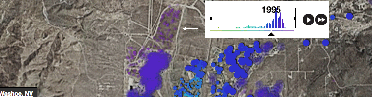
The image above is of Washoe, NV, just north of Reno, at zoom level 13. The color spectrum represents time, and the graph shows volume for a given year, so we’re looking at homes built in or before 1995. The small purple dots are homes built after 1995 (they start off small and fuzzy and get big and solid when it’s their year). But if you look at the map area indicated by the white arrow, there are no homes underneath the small purple dots. What this means is that the data that we have for home sales in that area is more up-to-date than the map below it, and that the map images are older than 1995, when the homes in that area were built.
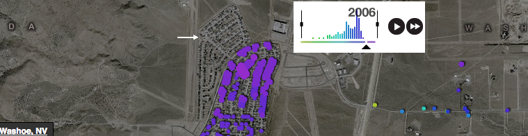
The map just above is of the same area, zoomed in a bit, at zoom level 14, with the timer set to 2006. Here we’ve got the opposite situation: the map below shows a new little subdivision (where the arrow is pointing, different than in the first map), but there’re no dots at all there (i.e. no homes that we know about). So in this case, the map is more up-to-date than the assessor data that we have for this area, and must’ve been taken after 2005, which is where the last dots show in the graph.
I love this kind of thing: time slippages between the maps and the data, overlaps between development years, strange spikes in the timelines from one year to the next. Gaps and holes and seams in the underlying maps and in the data that overlays them. Indianapolis only shows houses in a square-shaped area around the center of town. Gloucester has a wierd bump in 1900 where half the town suddenly appears from out of nowhere (Seattle’s is just fine for 1900). Most places are just fine, but every once in a while, if you look close enough, there’s something…interesting going on.
I think that it’s a mistake to think of these things as bugs to be fixed, or reasons not to trust the work — which is why I feel OK about writing about them, thanks Trulia :). Data visualization isn’t (only) about answering questions. It can have a much more powerful role: clarifying just what the questions are in the first place. Sure, there’s something that looks a little…unexpected, and means that something hasn’t been perfectly mapped. Why? No, really: exactly why, and what does this tell you about how the world is made?
The work of making the world clearer and more interesting through data visualization isn’t done, not by a long shot, and this is a good thing. Obviously the huge datasets that we’re all working with aren’t going to be fully current and complete in every detail: ultimately this stuff is all generated by people and it costs money and takes time. There’s never going to be a one-to-one map that shows every single thing in the world just as it is, and it’s a fool’s errand to pursue it too literally. My hope is that over time it becomes clearer that the value in these kinds of examples lies in their ability to let people look through these enormous datasets in ways that are (I hope) beautiful and pleasurable, and make it interesting to ask questions about how meaning is generated, and how the world is made.
Or, as Mike wrote much more succinctly: “Vast records of urban development are a joy to get lost in.”
Plus, this is just rad:
Finally, I have to say that nerding out about patterns in the spread of newly constructed homes can be a little problematic, even though we’re absolutely thrilled with the project. Sometimes watching these things and marveling in their aesthetic qualities feels a bit like playing the fiddle while Rome burns — Hey, check out how fast the Great Plains are disappearing!. But as it turns out, when you show people how much energy they’re using, they tend to use less, and there’s no sense in turning our back on the world — so I hope that the project can serve multiple purposes. Hindsight isn’t anything like an environmental advocacy project, but if one effect that it has is to provide people with a less abstract picture of what housing development in the US really looks like, then that’s one more good thing to come out of the project.