
This is a follow-up post about the piece we launched last week on Facebook Stories called “Data Visualization: Photo-Sharing Explosions.” The project took us a little over 2 weeks from start to finish, and we wanted to show you a bit about how we got to the final piece.
The Facebook team asked us to visualize the remarkable volume and virality of sharing of some popular images, with hundreds of thousands of shares happening over just a few days. Since so many people are involved, we came up with the idea of representing people as particles in a big system. After recent R&D, we realized pretty quickly that WebGL would be a great fit for showing this volume of activity.
Sketch, Scribble, Select
When we are handed a new dataset to work with, it’s imperative to begin sketching with it as soon as possible. Drawing pictures with the data can tell you all sorts of things, like the overall shape of the dataset, where there might be gaps or anomalies, and pointers towards which axes you might begin hanging things from to illustrate one element or another.
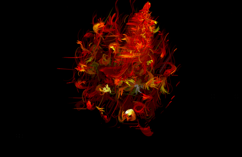
Here are a couple of screenshots and a video of Zach’s first WebGL sketches of sharing activity for a single test image:
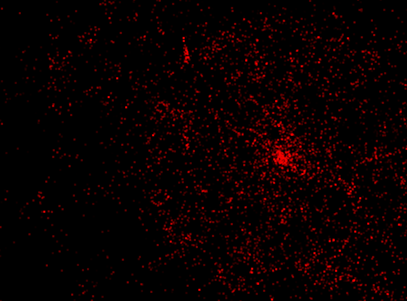
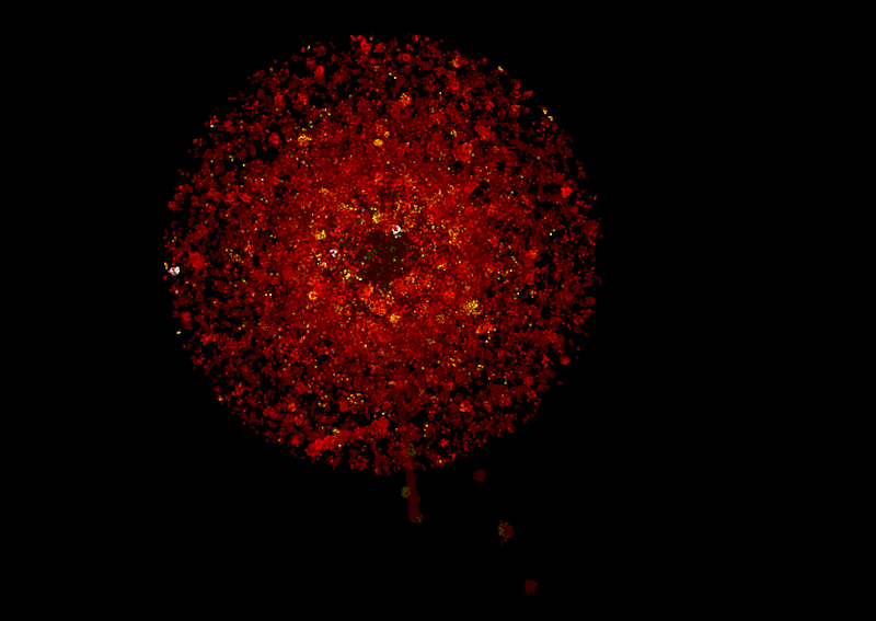
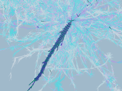
Even at this early stage, the “user as particle” concept felt right and continued to weave into most of our sketches after that. As we would discover, one of the challenges we faced was giving each person/particle a starting position that was meaningful in some way, not just everything emanating from the middle out. The data laid out a basic idea of generations of sharing through a social chain too, which we could exploit for better positioning.
Data Shape & Movement
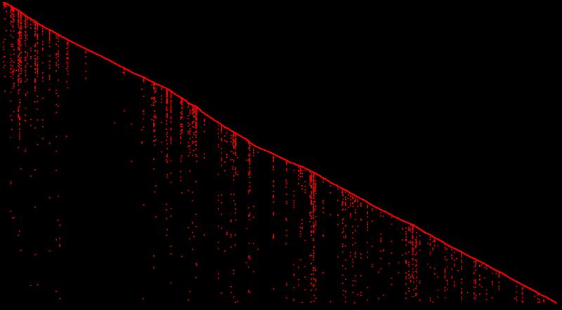
Rachel came at the data from another angle, graphing all the shares on a variety of axes, to get a feel for its grain and distribution. Here you can see a graph that maps each time we see a new person sharing along the x axis (time), and shares originating from that person dropping down along the vertical axis. Lots of drops means lots of resharing.
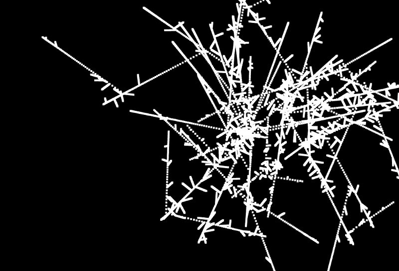
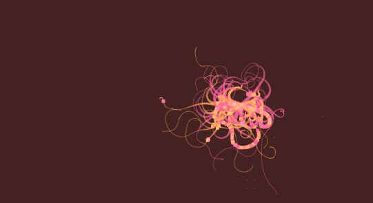
Now that we had more of a feel for the overall sharing trajectory, we started working on motion, movement and feel. Rachel’s first motion sketch was super exciting, and left us all giggling and gasping around her monitor. Look at what happens a few moments in:
I also really liked the “relief” of the shape left behind once the animation had run through and faded out. We ended up carrying this idea through to the final piece, where once the animation had played through, you’re left with a snapshot that encapsulates all the activity you’ve just watched.
Getting It All Out There
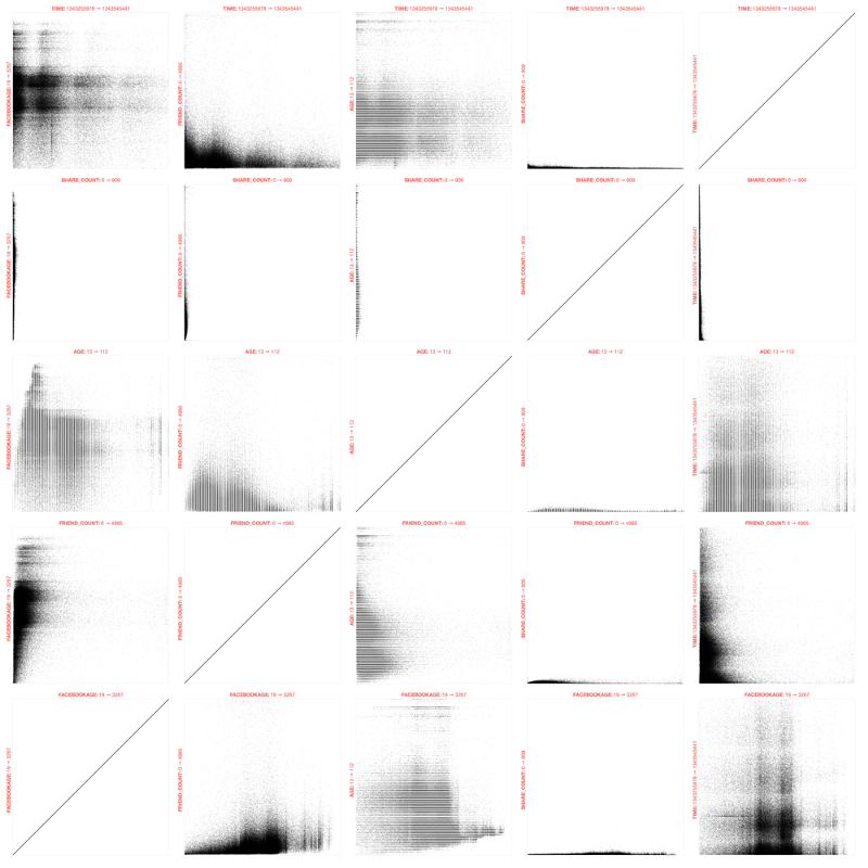
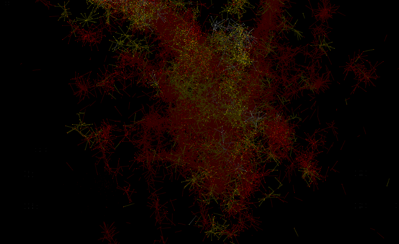
The particles’ movement was more or less random at this stage, so we set to work on hunting for variables we could use to inform the movement in the piece, perhaps to control velocity or direction of the particles. We had some basic anonymized demographic data like facebook age and friend count at our fingertips, which Shawn set about brute-forcing into a bunch of scatterplots in all combinations, so we could look for bumps or bunches or gaps.
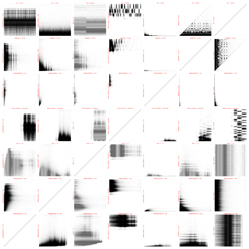
Laying things out like this lets you examine the texture in the data, and perhaps even have a “what the heck is that?” moment. Even though there were a couple of data hillocks here and there, we didn’t find any ZOMG bright spots for this single test image’s data. What we were able to do, though, was to cut away a bunch of demographics that weren’t at all interesting and highlight those we thought might be, like Facebook age (age of the account), and user age (as specified by the user), friend count and share count.

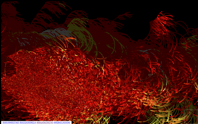
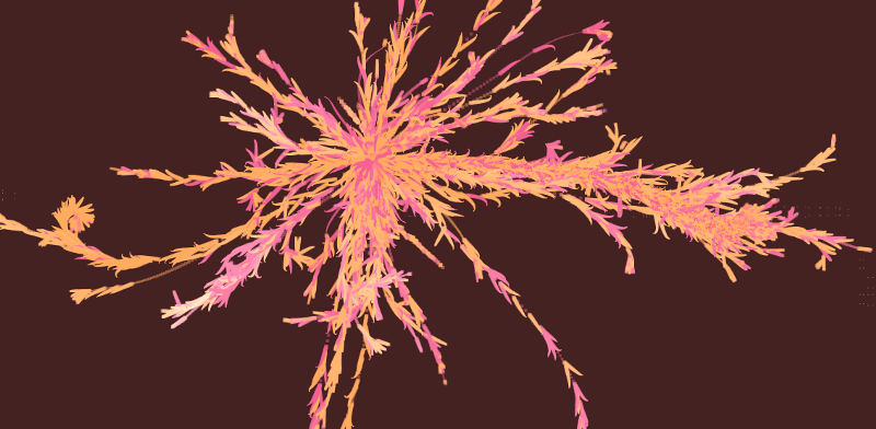
In the meantime, Facebook has settled on mapping the activity around 3 images shared by George Takei. He’s incredibly popular and prolific on Facebook, with a ton of friends, and loads of content. While the 3 images themselves are, shall we say, possibly not going to end up in a museum, they are amazingly viral, with up to 900,000 shares or so for “Famous Failures.” We took the demographic data for the 3 selected images and ran it through Shawn’s scatterplot tool. Incidentally, we’d also refined the fields that we thought were interesting to plot like this, cutting out the combinations that seemed like noise.
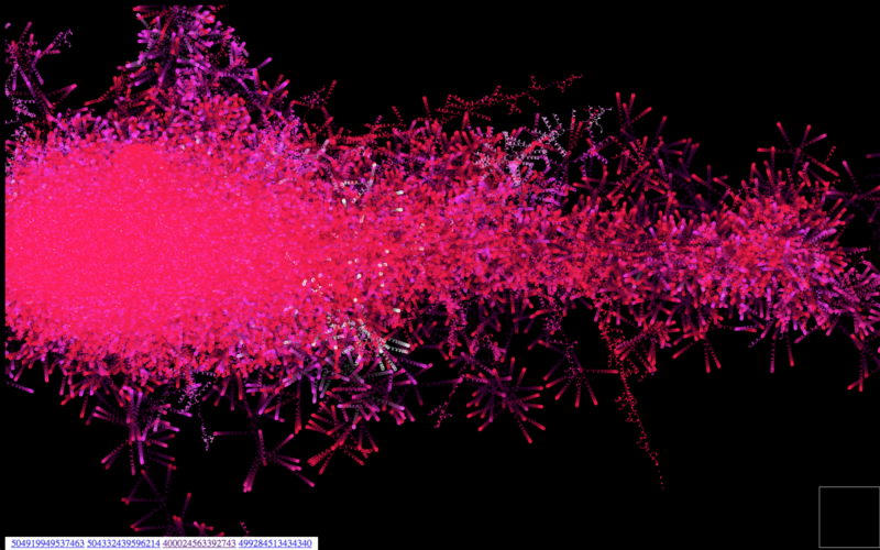
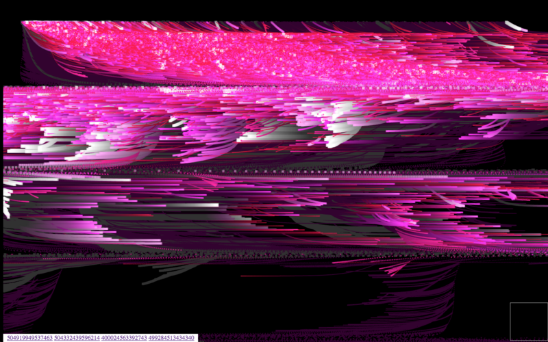
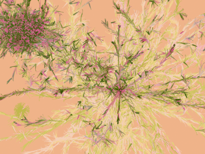
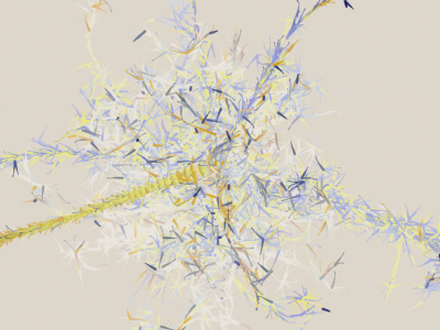
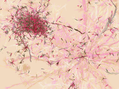
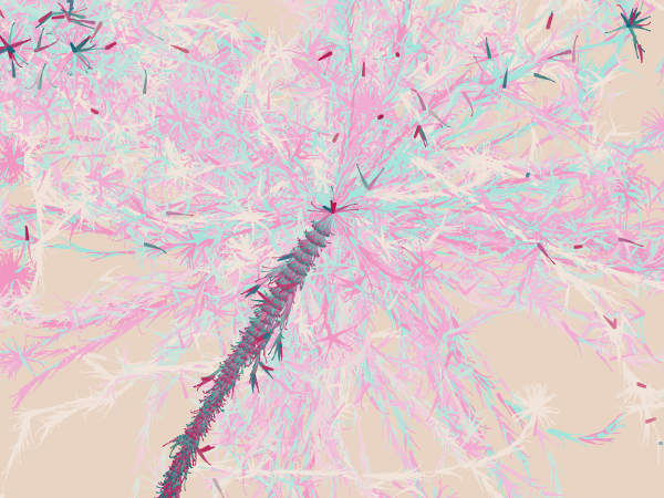
You can see from the animation that each of the images had mostly similar patterns in these scatterplots, even with the differences in the number of shares per image. What we did notice was that the age of the sharers was slightly different amongst the 3 final images we’d chosen, so we explored a direction using age as a positioning device. You can see that come to light in the visualizations below, where we spawned branches based on the sharer’s age (young on the left, old on the right), instead of from the center (or a node in a sharing branch) as before. We also introduced 2 colors into the mix, one for each gender in the dataset.
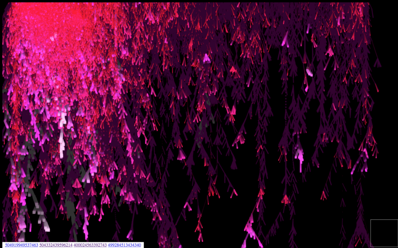
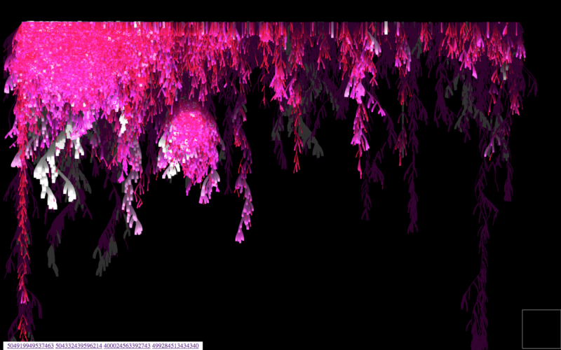
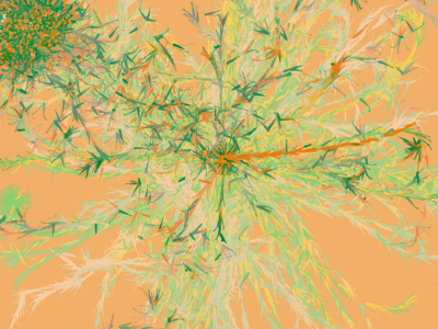
This same idea is rearranged slightly into a waterfall-y layout, where you can start to see the generations of sharing come to light as well, as we begin to look into color variations over time. The longer the sharing generation, the closer to white:
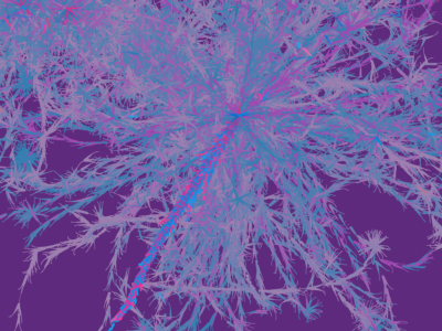
Particle Movement, Curves, Speed
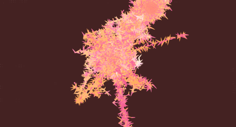
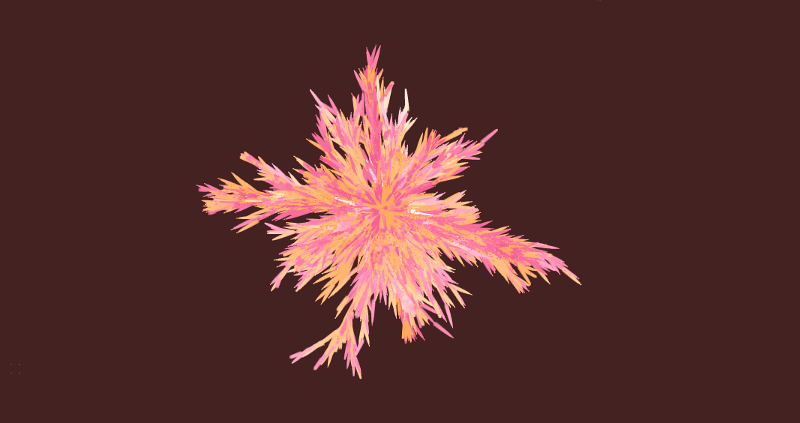
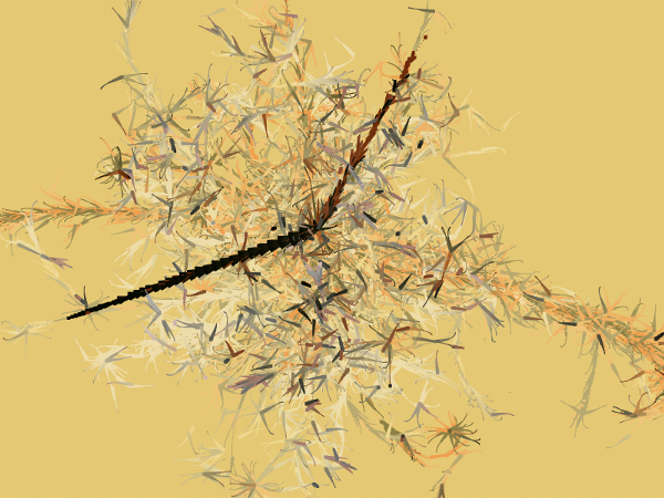
Now that we had the basic idea in place, it was time to start refining the movement of the piece. Here is a series of riffs:
This last sketch was getting very close. Close enough that we chose that model to refine, in terms of particle motion, and finally color.
Color
It’s not often that the Stamen design department swoops in at the end to “tart something up,” but in this case, it worked just fine. Our magical color wizard, Geraldine, then worked within Zach’s code to find the right color combinations for each piece. We wanted lighter backgrounds to try to emphasize the depth of each flower, and had our two gender colors to assign, each reaching towards white as the generation aged. It’s definitely more efficient when you reach a certain point in development to make tweaks directly in code, as opposed to working in Photoshop…
And, whoosh! Just like that, we were right at the finish line. The motion was looking great, and we were all still very excited with ooohs and aaahs as we played each iteration. Zach and I sat together to gently tweak the final motion, adjusting things like particle size over time, and the amount of curl on each generation until we were happy with it.
So there you go.
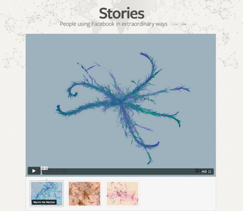
And, here’s the Facebook Stories page where you can browse each of the final pieces!
If you’re interested to read more Stamen process blog posts, try the Esquire Where The Maps Come From post, or our various Watercolor map expositions. You can also browse other videos on the Stamen Vimeo page.