
We keep detailed project blogs for the duration of all our projects, where we post work-in-progress, links to related material, and so forth. We do this both as a way to share with our clients where things are at, but also as a way of maintaining a record of the thinking that went into the work (after all, “You can control time when you can see it.”). I’ve often felt a sense of sadness that it’s only the final piece that sees the light of day; there’s a lightness to the experimentation that goes into the early parts of projects, when you’re not worried so much about final implementation and instead can just play. We’re going to start exposing some of this process, and this post is about the thinking that went into http://migration.stamen.com/, a recent project for Esquire Magazine.
Slicing & dicing
We started thinking about different ways to slice through the country. 1&, 5%, 99% are all in the news a lot lately, as is the idea that the American Dream of work hard & save your money & get a house & you’ll be fine is true for less and less people all the time.
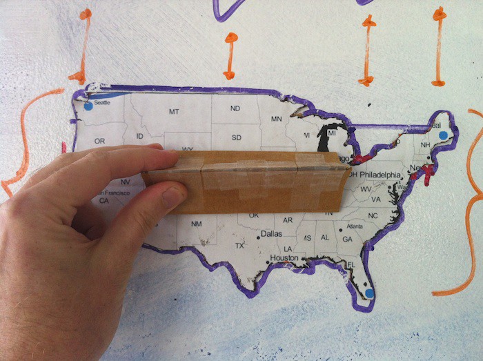
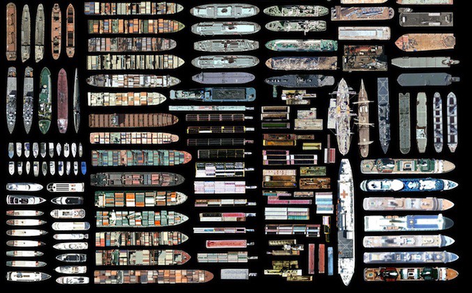
Our first idea was to break up all the zip codes across the country into different forms, based on demographics. Kind of like Jenny Odell’s collages of [tankers from google maps]:
But instead of ships, there’d be the shapes of all the zip codes where, say, more that 10% of all homes are in foreclosure. I started sketching out maps of where some number of people have lost their jobs, or where the economy is strong; some aspect of economic life that matters to people now. And then, perhaps, you could arrange those back into a more visually-like-the-US map:
Slicing & splicing
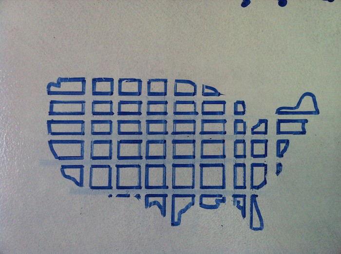
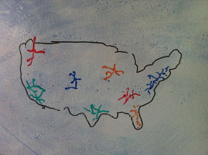
We thought about a different kind of slicing: take a latitude line across the country, and find all the towns along that line. Every time you get to a town, you measure a series of demographics: age, income, education.
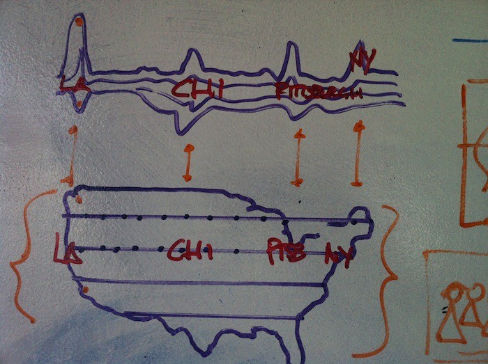
Stack enough of these on top of one another, you start to see patterns in the way the country is arranged: places with high populations of young people and lots of poverty, right next to places with the opposite. You get a literal slice through the country.
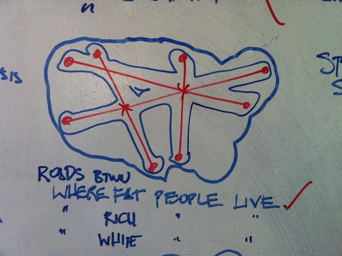
Maybe those lines aren’t just latitude or longitude lines. Maybe they’re lines along roads from one place to another. Find the poorest places in America, plot the routes between them, map obesity along the way:
Reverse this idea: instead of starting from one poor place and driving to another, find a route that goes only through poor places. Would you be able to get from Allen, South Dakota to Elmo, Montana, only driving through [poor places]? What would those routes look like?
How far could you get, if you could only drive through towns where the majority of people who lived there are under 40? Are there age sheds, just like there are watersheds and foodsheds?
(map by [Ryan Alexander])
Comparing rich to poor, we might find that some of these routes overlap quite closely; or that they never touch at all.
Demographic isobars
We could start to think of these routes as weather fronts: places that push up against one another without quite touching, but which affect each other as they roll past:

Maps of where the haves and have-nots live and work might start to emerge as distinct patters of relationships, depending on how you turned the dials. The 1% and the 5% might have more in common than they think. Or not; depending. Let’s find out! Also, George has just pointed out to me that “iso chubbs” is not nearly as neutral a term as I had thought when I wrote it down, so that’s a thing.
First stabs
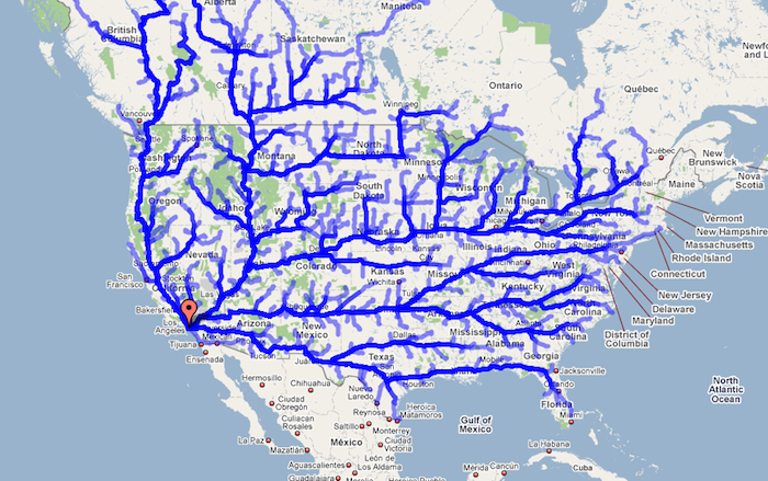
First, Mike plotted the routes people likely use to leave California, and where they end up:
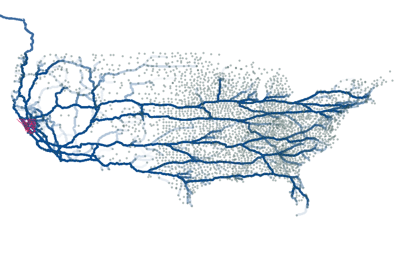
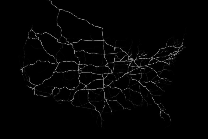
Second, Jeff did this for all the roads in the US that people have moved along; thicken them by how often they’re used (and note the crazily-well-traveled road up to Alaska):
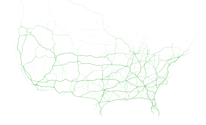
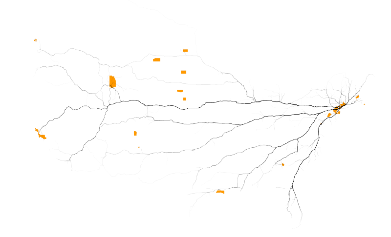
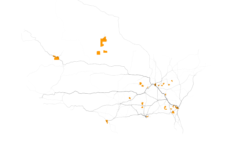
Compare the roads that the top 1% of the money travels along:
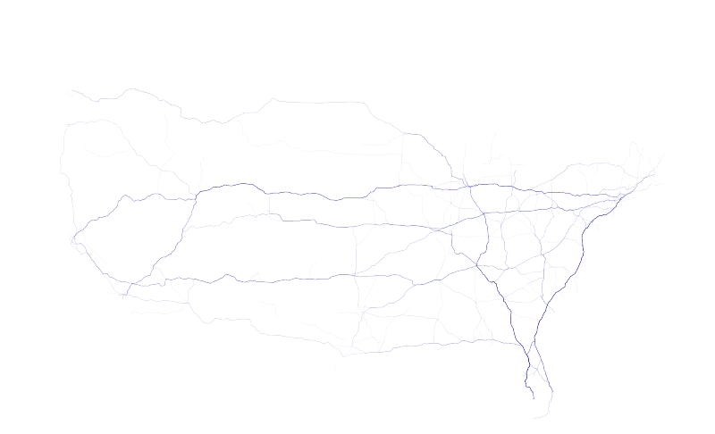
to the roads the bottom 1% of money travels along. Notice that even though the amounts of $ are the same in both graphs, the road networks are a lot more extensive in the second, because there are alot more people moving at the lower levels of the scale:
Testing, testing
George and Geraldine started thinking about how these maps might overlay and interact with one another, and came up with a couple different ideas that we liked:
Dialing back
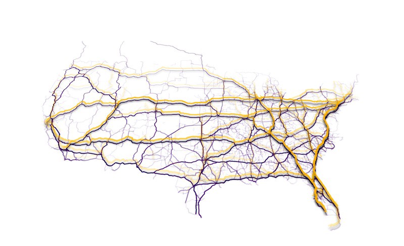
Ultimately, though, none of these were as satisfyingly crisp and direct as Jeff’s original sketches of the richest and poorest 35 counties, respectively. This idea of little archipelagos clustered along major travel routes, and the non-intersection of rich and poor, was more what we were looking for:
And so
At some point Mike wrote “Can you make, like, a hundred more?”
LIMIT 35 OFFSET 35, LIMIT 35 OFFSET 70, LIMIT 35 OFFSET 105
and we were off and running. The final piece lets you move through the whole range from the top 1% to the bottom, and the different constellations and nooks and crannies of the moving American economic landscape are laid out like cracks in so much financial ice.
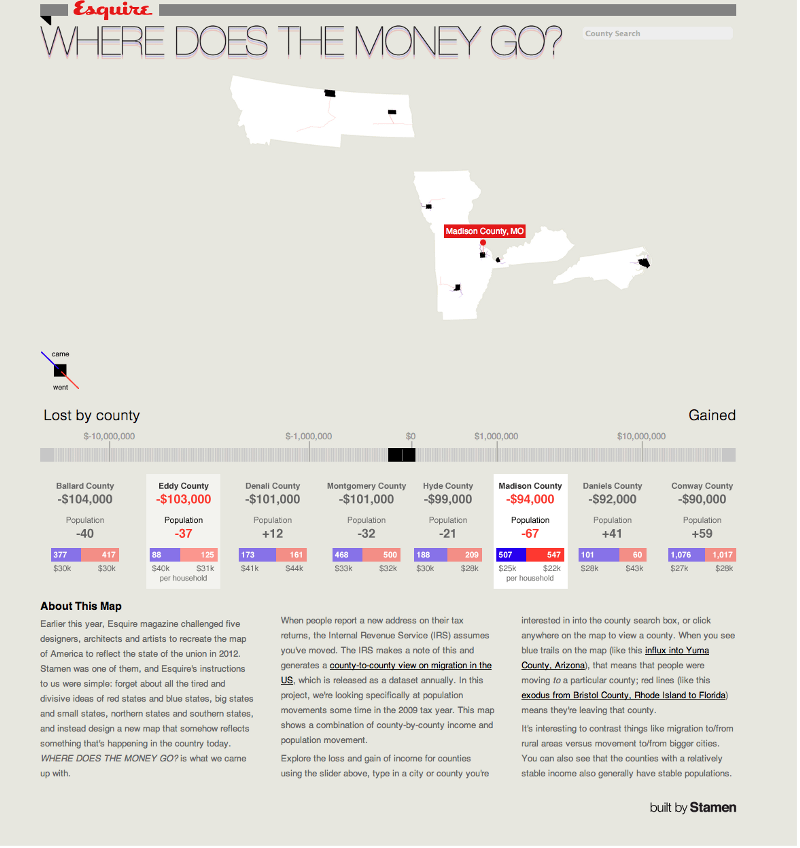
More at http://migration.stamen.com/