
It’s been a productive couple of months here at the studio, so much so that it’s been difficult to find the time to blog about projects as they happen. We’ve added some new people, for one thing, and started to really get our hands around the operations side of the business. Which is great — but I’m now sitting on a serious backlock of communicating about the work we’ve been doing, and it’s time to change that. I’m going to try and tackle these one project at a time over the next couple of days; hopefully I’ll be caught up by the time we close for the last two weeks in December.
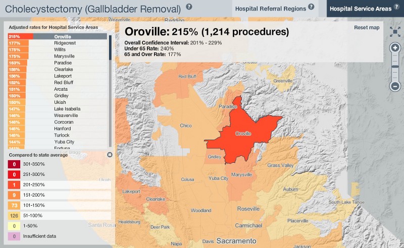
In late September we published some work with the California Health Care Foundation, mapping variations in Elective Procedure Ratesacross the state. In English, this means we looked at how likely people are to do things like have their gall bladders removed — surgery that’s not done to immediately save their lives — depending on where they live.
It turns out that, all other things being equal, that there’s quite a bit of variability across the state, depending on procedure. CHCF adjusts for demographics in a given HSA (Hospital Service Area), factoring out things like the age and income levels of the people that live there.Oroville, for example, has more than twice the number of gall bladder removals done than the statewide average:
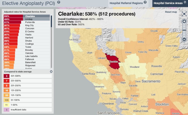
And in Clearlake, you’re more than 5 times more likely to have heart surgery than in the rest of the state. This report was picked up byseveral media outlets; turns out that Clearlake has an overenthusiastic heart surgery department (in addition to a population that smokes and drinks too much), but even factoring in people’s lifestyle choices, the numbers just leap off the map:
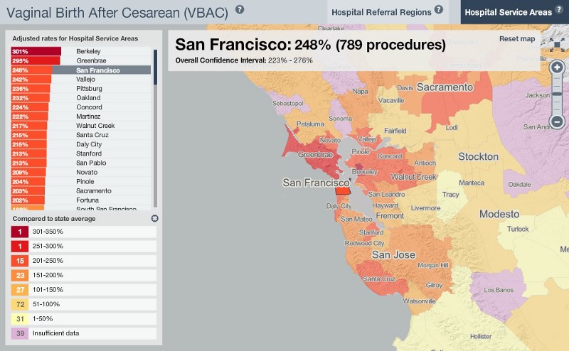
Other procedures are less dramatically different from area to area, but there’s still some variation, and these maps can start to serve as entry points into more detailed and nuanced conversations about why health care is so different from one place to another, even in an area as relatively homogeneous as the Bay Area. The whole point is to kill less people, and getting a grasp on how procedures vary from place to place is a good way to move the conversation further down that road.
The cartography for the project is custom, a modification of GeoIQ’s acetate design that we built for them earlier this year. The sizes of city labels on most maps you see are based on the number of people that live there. Using Dymo, a placement script for map labels, we’ve gently subverted this so that the size of the town names reflects the number of procedures done in that town. By this measure, you can see that Clearlake, a small rural area, is basically off the charts:
OK. Killing less people. More to come.