Feb 13, 2007
Cabspotting, always in progress
When the Exploratorium and Scott Snibbe approached us in 2005 to visualize realtime GPS positions of San Francisco taxi cabs in the Cabspotting project, we leapt at the chance. Taxi data is highly dynamic, mappings of it change noticeably from viewing to viewing, has an easy reference to the real workd, and the data lends itself to visually inspiring and meaningful work with the lightest of touches from us; all things we like.
It also suggests a wide range of potential new questions to answer and new things to make. Adam Millard-Ball's suggested applications for just about everyone: taxi drivers (how long is the average wait for a pickup in this neighborhood?), taxi passengers (obviously, where's the nearest taxi, but also do they tend to be here at this time), TLC planners (do we really need more taxis in North Beach? the data'd tell you), and city planners (looks like alot of people are taking cabs at 8:50am from Point A to point B, maybe we should have a taxi stand or ride share there?).
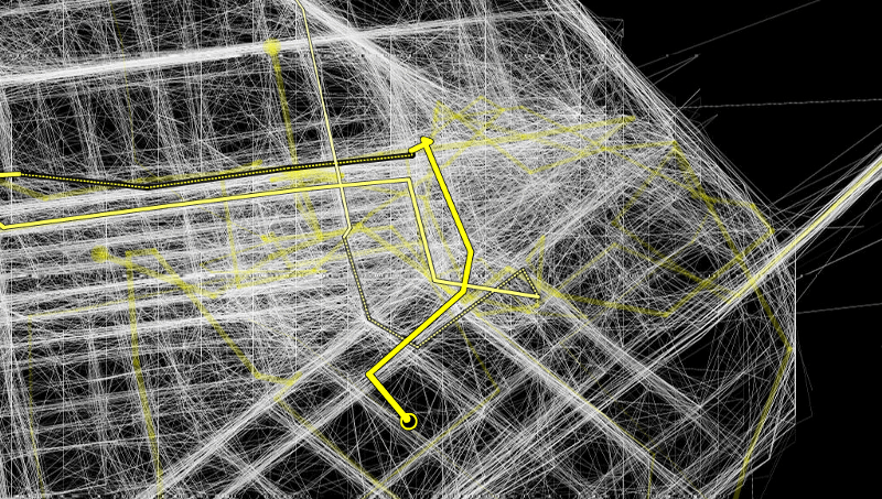
From the beginning, we made a deliberate decision to map only the data—to let the material we were getting from YellowCab tell the story, and not to rely on any kind of overlay or specific relation to an underlying, pre-generated map. We wanted to see what story the data itself would tell. It resulted in some pretty interesting artifacts; in particular the activity around the Bay Bridge between San Francisco and Oakland.
The bridge has two levels: you drive from to Oakland to San Francisco on the upper deck, and in the reverse direction you're on the bottom—where GPS signals can't reach. Taxis on the westbound upper deck report at a normal time interval (about once a minute), and a line is drawn fairly accurately along the span of the bridge. Taxis on the eastbound, lower deck, though, report their position accurately up to the point at which they pass under the upper span, report nothing at all while they're out of range of satellites, and then begin transmitting accurately once they've popped out the other side. It looks like this:

Overlaid on a google map, the route of the bridge becomes clear, as do the starts and ends of the lower deck:

We loved this when we first saw it; the regular, measured flow of data, moving on to the web from the physical world, presented a vision of the world that gave you a different kind of insight than was available by normal means. It felt similar to the moment where we discovered that drivers along Route66 had unintentionally collaborated to build a flickr map of this historic but now-unofficial highway. Strictly speaking, the knowledge of these aspects of the world already existed—anyone who drives the bridge knows about the two decks, and Route 66 is a fairly well-known tourist road—but what excited us was the organic nature of the process, the emergence of the thing, the individual thing that was true that made all the other parts true. If GPS traces could make this aspect of the world visible, what else might they reveal?
Then it broke:
Early this year we were showing the project (at a prospective client meeting, of course) and noticed a distressing change (as did our client...). What were formerly slender, elegant bundles of lines gracefully wrapping themselves around intersections, gently revealing slight offsets from straight north-south streets, quietly clustering around the cab depot, flinging themselves with abandon out into the bay but always returning to their natural places, had been replaced by... a mess:
Cab positions reported in Ohio
We returned to the studio to find a mail from Michael Ang, an artist that Scott had introduced to the project. In the process of working with the Cabspotting API, he'd also noticed that the data seemed to have gotten a bit out of hand. Michael kindly worked up some graphs of traffic stats over time for different cabs, and made some striking images that showed what we had feared. The data was borked:
Longitude started to vary wildly
The above image shows the longitude range for a single cab over time(the full size image has more data. Up until the first week in January, everything looks normal, within a reasonable range. Then the range suddenly jumps, way off the scale, and stays at this new level. Note that the vertical axis is a logarithmic scale; so we're not talking a simple doubling or tripling of longitude, but an increase by a factor of 10 or more.
From Yellow Cab's perspective (we called), nothing had changed—the cabs certainly weren't picking up calls in Ohio, and their whole operation seemed to be running as smoothly as it ever does. We scratched our heads for a while, and eventually made a connection to the company that manages Yellow Cab's data feeds. It turned out that they'd reduced the rate at which the system asked for data from each cab; something to do with radio frequency bandwidth that needed to be reserved for some operational changes they were making to the system. The outliers were easy to discount—clearly any cab whose speed seemed to be over 100 miles and hour or so was reporting a wrong position—but we were reluctant to do so overmuch, specifically because of the Bay Bridge example above. The project was supposed to represent the data, not the map—and as such was responding to a change in the weather, so to speak.
This weekend, the system was stable enough for the data rate to increase to almost pre-borked levels; we formerly got data about once a minute, and now we're about at a minute and a half or two minutes between updates. It looks good—not as good as it used to, but certainly better than it was:
A little less frequent, but better
What's Next:
The firm that manages the GPS feed for Yellow Cab does the same for a number of other cab fleets, including one in Seattle, which we hope to gain access to. Another is in South San Francisco, the dataset for which should be coming online shortly. We'll be able to tell which cab is from which fleet, so there's an opportunity to understand the relationships between activity in different municipalities.
We've also been in touch with the SFO Noise Abatement Office—they have a live version which shows airplane traffic positions (and altitudes!) 10 minutes after the fact. Airline and destination/departure location aren't available live, but after 24 hours this data is available; so it should be possible (and interesting!) to show the relationship between live and historical data, as Cabspotting already does.
Post Script:
We had a similar issue with our earlier In The News project, which mapped popular terms on Google News over time. Google made a change in the algorithm which generated the news items, our visualization picked up on it, and the results suddenly became much less meaningful. You can see how this looks here.